Issue 16: Back to School
On learning, knowing, and the good grades we give ourselves.
✏️ Learning by heart
The 30 seconds I spent studying for the LSAT notwithstanding, I knew was done with school the second I graduated college. This was a risky game since my degree had nothing to do with my intended career, but even as someone who did well in traditional school, I wasn’t a fan of classroom learning. I often felt the learning systems I knew were meant for one specific type of learner—and to this day, I’m not totally sure who that is. Learning often felt like a chore, and it took years in the real world to realize learning is an unadulterated joy if you only find the style that works for you.
Later in this issue, I discuss how every designer crafts their process to their strengths and how this flexibility is a prerequisite for good results. As we enter the back-to-school season, I’ve been thinking about how learning is the same way. In my early years as a designer, I often felt inferior with my lack of formal training. But the more I thought about it, the more I realized pursuing the knowledge that excited me and applying it in a practical context was the best education my personality could ask for. Beyond design, I’ve found letting go of expectations of what I should be learning—or how—has fostered an inextinguishable curiosity. I’m positive we not only learn more when the process excites us but that we can do so much more with that knowledge as a result.
That’s why this week, we’re all going back to school. We’re reading books we love, going down 2 am Wikipedia rabbit holes, getting really knowledgeable about our favorite movies, and letting new experiences take us out of our comfort zones. We’re decorating our lockers, applying theory to the real world, and FINALLY writing in that notebook we’ve been saving. Read on for all this and more!
🚌 Moodboard of the week
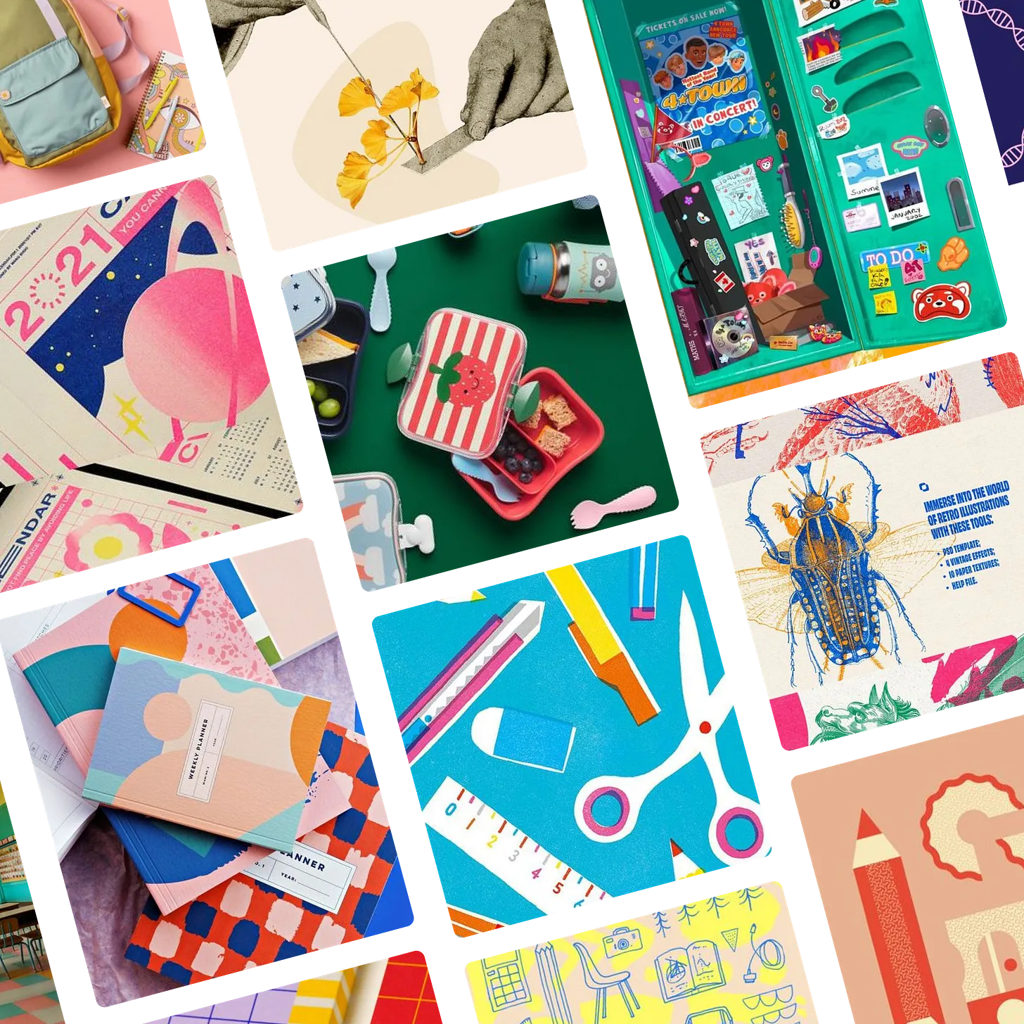
The Back to School Moodboard is inspired by school and, more importantly, school supplies. It’s scientific, it’s artistic, and it packed an adorable lunch. It may or may not do great on its exams, but you know it’s going to create a gorgeous study guide. Click here to see the original images and full board on Pinterest!
🔍 Question of the week
“How do you design a logo from scratch?”
Final Part: Liftoff!
In this final part of the design process series, it’s time to see how a design goes from theory to practice! At this point we’re all over the moon with the final result, but we can’t do anything with it yet. Most often, the people using a logo are not trained designers, so we need to devise a plan to make sure the logo looks amazing no matter how it’s used. Even though the designer won’t always be the one using the logo, it falls on the designer to ensure it always looks great. How do we do that? Here are some of the steps:
Create the logo in every possible layout and color
Ideally, we want to use the logo exactly as we designed it, but this isn’t always possible. Sometimes print restrictions mean we can only use one color—or none at all. Sometimes a logo will be printed super small, rendering the text unreadable. Sometimes we can only use text; other times, we can only use an icon. Maybe we’re making branded pencils and need a logo that fits in a narrow space. For this reason, we need to create versions of the logo that work in every potential scenario. By the time this process is done, we’ll likely have 25-30 possible logo versions, if not more!Save the logo in every possible file type
Once the logo is designed for every possible layout, we need to make sure it can logistically be used in every context. This means we need to have print-ready and digital versions that will be supported in every context and super high-quality versions that we can use under ideal circumstances. This means we need PNGs, SVGs, EPS files, and often more. At this point, we likely have well over 100 files.Organize and send with instructions
Once all the files are saved, I organize them in a way that helps my clients easily find the one they need. I send these over, along with a usage guide that gives detailed instructions on how to use the logo in an on-brand way, which versions to prioritize, and what each version might be used for. If time and budget allow, we may even have a live tutorial.Launch 🎉
Finally—FINALLY—we’re ready to send the logo out into the world! Sometimes clients like to launch with fanfare (social media posts, website announcements, or even a live event), while sometimes, especially with smaller brand evolutions, the best choice is to simply start using the logo without fanfare. I always let my clients lead the way here.
And with that, the design is complete! As you can see, the journey to create a design is complex and involves not just visual skills but communication, analysis, and more. And, of course, this is just how I do things. My process is very analytical and thought-heavy because that’s who I am as a person, but every designer will shape their process to their particular skills, and, incredibly, we all get where we need to be in the end.
Thank you so much for following along through this series. Check back next week when we answer a completely different (and super fun) question, and of course, don’t forget to submit your design questions by sending me a message below or leaving a comment on this post!
Submit your burning design questions by sending me a message below. Questions can relate to design itself, entrepreneurship, workflow, or anything you think I may be able to answer. There are no limits.
🎧 Soundtrack of the week
This week’s playlist is inspired by hopeful energy, new friends, year-end slideshows, and songs that defined my school years, for better or worse. Check out the playlist below, or click here to listen and save on Spotify.
💙 My Favorite Things
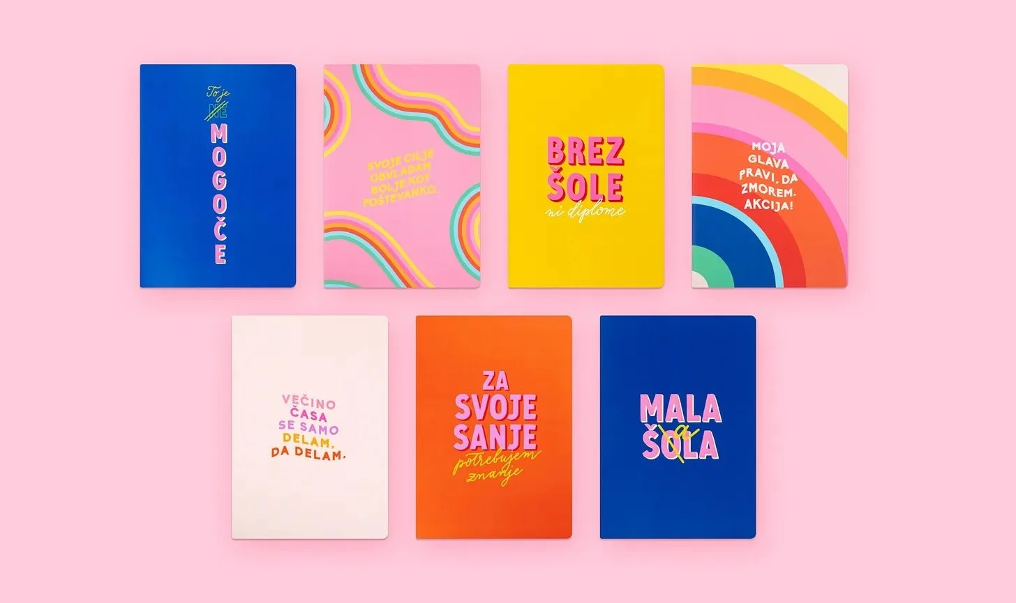
When I picked up these notebooks in Slovenia a few years ago, the shopkeeper asked, a bit incredulously, “…you speak Slovenian?” It will surprise nobody that I don’t (much to my chagrin), but I love these specifically because you don’t need to understand the words on them to know what they say.
Google Translate confirmed that the covers of these sunny and bold notebooks are graced with clever and positive reminders to be confident, pursue your goals, and study hard, but, like all the best designs, the visual messaging does the heavy lifting when the words themselves escape you.
Notebook covers designed by Slovenian YouTuber Lea Filipovic, also known as Lepa Afna. Images sourced from her website.
🌱 Touching Grass
📖 What I’m reading: I had written off Red, White, and Royal Blue because I have been burned one too many times by the best-selling queer beach-read romances of TikTok. But when a friend specifically recommended it to me last week, I took the plunge. It is excellent, I fear, and I may or may not have Casey McQuiston’s entire bibliography lined up and ready to go for when I’m done.
🎧 What I’m listening to: In addition to the back-to-school season, the back-to-dance season is also upon us. I’ve been listening to a lot of jigs as I gear up for an intense few months of training for the New England Oireachtas—the Irish dance regional championships—coming up in November.
🥣 What I’m eating: My sister pointed out that I was spending an embarrassing amount of money on Chobani Flips, so I’ve been experimenting with my own lightly-trashy dessert-flavored yogurt inventions for the last week or two.
📺 What I’m watching: I keep forgetting that all the original BBC seasons of The Great British Bake Off (the Paul, Mary, Mel, and Sue years) are available on the Roku channel for free—including seasons that were never on Netflix. I went back to the beginning over the weekend, and it’s better than I remember.

