Issue 15: Hobbit Girl Summer
"I'm trying to hype you up, good sir!"
🍄 There and back again
I had the immense joy of spending a day at the New York Renaissance Faire this past weekend. The last time I attempted a trip, we got stuck in standstill traffic for 3 hours, missed almost the whole day, and had to leave after one (1) joust. This time we were at the gates an hour before opening and spent an enchanted day trying on fairy wings, obsessing over handcrafts, and gossiping with Maid Marian who is, by the way, a total sweetheart.
As a designer, a fantasy nerd, and (in virtually all other cases) a stickler for accuracy, I’m obsessed with the Renaissance Faire aesthetic—one that has virtually nothing to do with the actual Renaissance. We spent the day wandering a set straight out of Duloc, ourselves dressed as two hobbits, an elf, and a princess, gushing over costumes, and trying to figure out how, if at all, the actual theme of RenFaire can be defined. It’s fantasy, except where it’s historical. It’s old, except where it’s new. Medieval looks, from any part of the world, are it. So are virtually all fantasy costumes, pirates, and fairies. Steam punk? Absolutely. Mushrooms? Hell yes. Anime? Not typically, but also not never. Renaissance looks? Kind of dicey (I defy anyone to show up to RenFaire dressed as Leonardo DaVinci).
This is my favorite kind of aesthetic: one based not on a set of rules but on a target feeling—in this case, creativity, non-judgment, welcoming, coziness, adventure, and fantasy, by every definition. You know it when you see it, but you also get to decide for yourself what you want it to be. When I design, the last thing I want to do is to fall in line with what has been done before. The goal is always to curate a vibe that not only stands alone, but can evolve as it should. Themes like these not only cultivate creativity and innovation, but they allow us freedom to continue improving them—to make our environments more welcoming in practice, for example, or push the boundaries of what fantasy means to us.
That’s why, this week, we’re taking a look at design through that loosely-yet-perfectly-defined theme—what we’ll refer to from here on out as Hobbit Girl Summer. We’ll pick flowers the yellow glow of the afternoon sun, learn how to help a design leap off the page, jam out to the most tragic of ballads, and get our fairy wings. Read on for all of the above and more!
🌾 Moodboard of the week
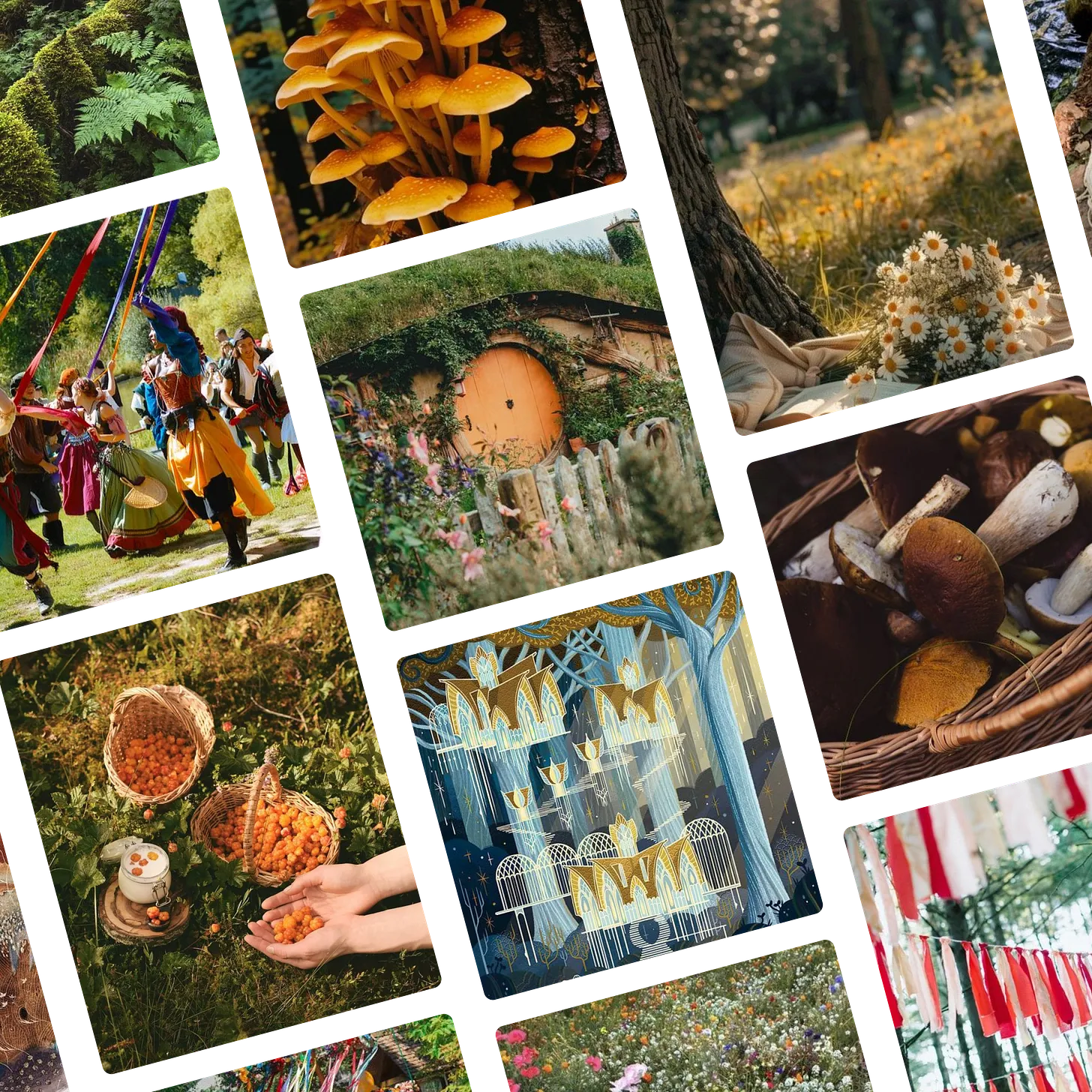
The Hobbit Girl Summer moodboard is inspired by the lazy days of August and a slow life I have never lived but like to pretend I’d like to. Click here to see the original images and full board on Pinterest!
🔍 Question of the week
“How do you design a logo from scratch?”
Parts 6: Elaboration and Refinement
You’d think that once we select a logo shape, it would be ready to send out into the world, but in many ways, the hard work on a logo project is just beginning. There’s a big gap between a logo and a brand, and even the most evocative and meaningful shape cannot, in itself, give off the holistic feeling that a full brand must. Once we’ve settled on a final shape or two, now we have to figure out what to do with it, knowing whatever we do here is going to set the tone for whatever we do next. It’s high-pressure, but fun, because now, we’re going from finding inspiration to creating our own – effectively building a refined, one-symbol moodboard that will impact everything we do going forward. Here’s what this involves:
Color
Since I always create logos in black first, color is one of the first tools I use to bring it to life. The colors we use in the logo, will almost always be the same we use in the brand’s broader color scheme, so I usually use a separate process to work with my client to select a color palate they love. I then play around with the design itself exploring every possible way the colors can be incorporated to both make the logo look beautiful, and use it to set a tone that represents the brand.Typography
Unlike color, the typography in the logo typically does not incorporate the fonts we will use in the brand more broadly. While 99.9% of the time this typography will be rooted in some font, I virtually always customize the type—sometimes to the point where it’s barely recognizable—for the logo itself. I do this for a few reasons. One reason is that fonts are, by definition, stock assets meant to be used broadly, and are unlikely to represent a brand perfectly by themselves. Another reason is that any given font is stylized well enough for most uses, but won’t be perfectly spaced or shaped for any given word. Since we’re going to be using this a LOT, it’s worth taking the time upfront to make sure it is perfectly arranged and coherent for the specific context. Finally, this typography needs to look branded on its own, since many contexts will require us to use the name without the symbol (this usage is called a logotype). I usually present each concept with a few type options, so we can really hone in on the tone we want to set.Style and texture
The last thing I do is explore whether any other elements can be incorporated to better represent the brand. Sometimes the logo looks best flat, geometric, and simply presented (this is actually how most logos are done) but sometimes incorporating a gradient, a rough texture, or another stylistic technique will take the logo to another level.Smooth the edges
Once we’ve done all of the above and settled on the winning concept, the final step on my end is to take a pixel-by-pixel look at the logo and see what needs to be refined to make it really professional. This may involve literally smoothing out any edges, very slightly rounding any jagged corners to make it easier on the eye, going over letter spacing with a fine-tooth comb, or working out any other kinks that got overlooked in the many steps of the process. Once this is done, the logo is done and we’re ready for launch.
Even though the logo starts to feel real in the concept stage, by the end of this stage, the whole brand should have come alive. While there may be more steps to blow out a full brand suite, a refined logo will make the path ahead clear so the rest falls into place. Tune back in next week for our final installment – getting ready to launch!
Submit your burning design questions by sending me a message below. Questions can relate to design itself, entrepreneurship, workflow, or anything you think I may be able to answer. There are no limits.
🎧 Soundtrack of the week
This week’s playlist is a blend of old ballads and folksongs, fantasy soundtrack classics, and modern tunes that give off the Hobbit Girl Summer vibe. About 99% is “inspired by” (stolen from) from Francesca’s RenFaire playlist because, and I can’t stress this enough, why do your own work when you can get your little sister to do it for you? Check out the playlist below, or click here to listen and save on Spotify.
🧚 My Favorite Things
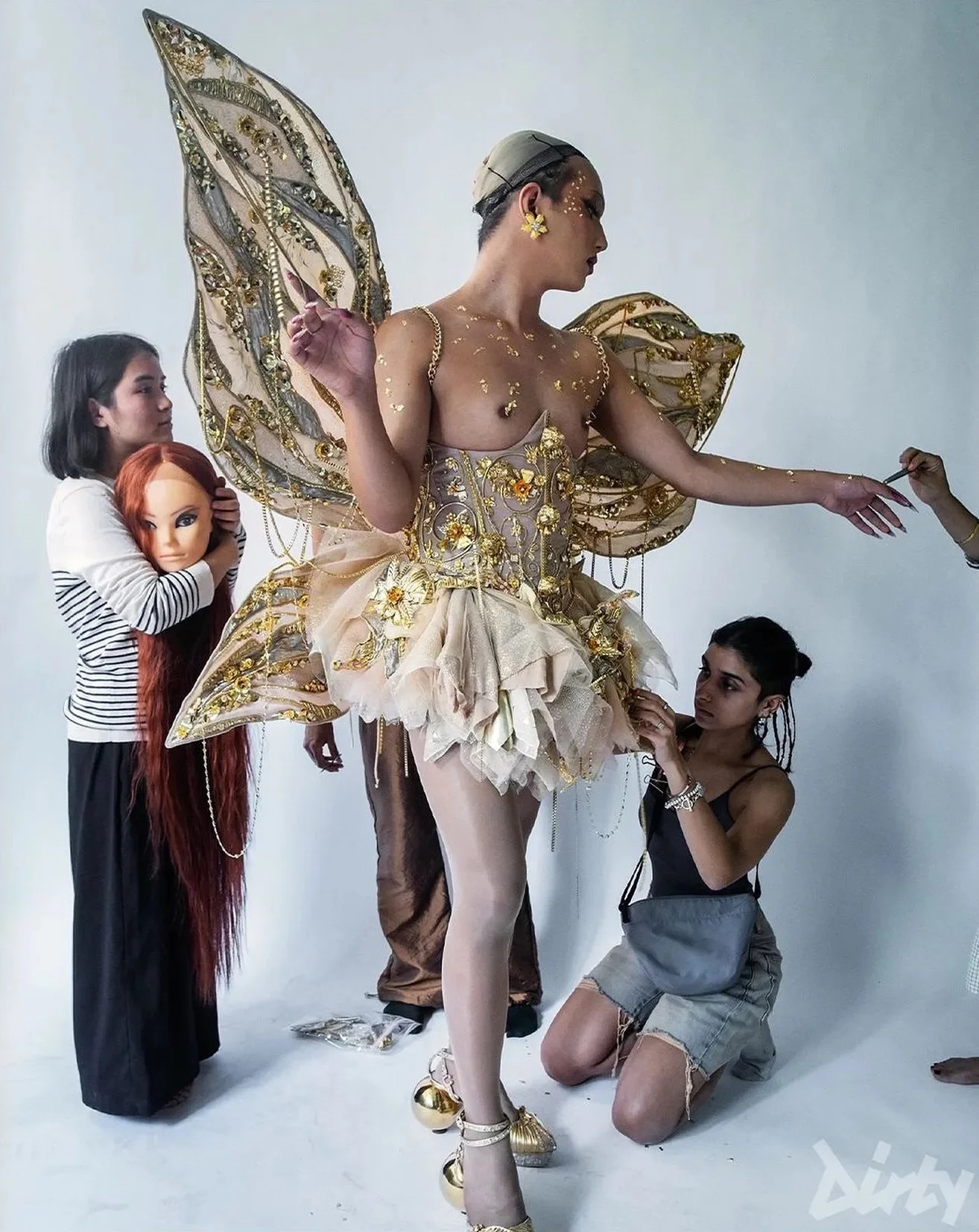
Indian designer Papa Don’t Preach by Shubika has long been one of my most consistent inspirations. As a fashion house focused on ornament, pattern, and modern design that draws heavily on traditional techniques and motifs, I always learn so much from their designs, even though I work in a completely different medium. This fairy design, custom made for drag queen RoxY K Versace and featured in Dirty Magazine is a true fantasy that embodies their intricate and opulent style.
Image sourced from Papa Don’t Preach on Instagram. Check out their website too. Everything they make is unbelievable.
🌱 Touching Grass
📖 What I’m reading: I listened to about half the audiobook of Americanah by Chimamanda Ngozi Adichie while cleaning my house on Sunday. It’s gripping and phenomenally written and I can’t wait to finish the rest this week.
🎧 What I’m listening to: Catching up on Dear Hank and John during the Gabrielle Finally Paints Her House Eleganza Extravaganza.
🫐 What I’m eating: I went blueberry picking recently, and started two giant jars of blueberry cheong—a Korean fruit syrup made by cold-steeping fruit and sugar, allowing the sugar to extract the pure flavor of the fruit (as opposed to most preservation methods which cook the fruit and change the flavor). It’s literally one of the most delicious flavors on earth (and ridiculously easy to make) so I’m hoping it’s done this week. If so I’ll be putting that on everything.
📺 What I’m watching: My sister sent me these videos by Oxford professor Roel Konijnendijk where he breaks down famous battle scenes in historical/fantasy movies and explains why none of them make any sense. I haven’t laughed so hard or learned so much in years. They literally (figuratively) made me want to go back to school, but I’ll settle for watching them on repeat.

