Issue 17: All Things Bright and Beautiful
On Word Art, big risks, and tasteful neons.
🌟 Fortune Favors the Bold
Happy Tuesday, and welcome back to the show! I hope those of you who had a three-day weekend enjoyed it to the fullest, and those of you who didn’t at least got a barbecue out of the deal. I hope everyone’s feeling refreshed and ready for a beautiful week ahead, the beginning of autumn (I hope), and, of course, this week in design!
As someone who cares very much not only about my job, but the future of my field, I spend a lot of time thinking about what makes good design. I often joke that it’s my job to make pretty things, but the truth is, it’s actually really hard to put your finger on what makes design successful. Should it be pretty or unpretentious? Should it stand out or have broad appeal? Should you stick to the rules you know will work, create without regard for the rules, or purposely take wild risks against common wisdom? And, when we really get down to it, do we always have to choose?
There’s no easy answer to any of these questions. Design, as life, is often a question of finding the balance that works for the challenge at hand. But I also think so often we view a lot of the traits above as mutually exclusive. We think making a bold statement sacrifices broad appeal, that throwing a neon on something will undermine its beauty, and that something pretty will naturally feel, at least to some degree, exclusive. And while I think we can make choices, we don’t always have to. At least for this one week, I want us to have it all.
That’s why this week, we’re exploring design through All Things Bright and Beautiful. We’ll snack on delightfully fluorescent meringues, scream-sing all the way to Friday, and discuss when, if ever, it is worth sacrificing beauty to stand out. Scroll on to read!
💖 Moodboard of the week
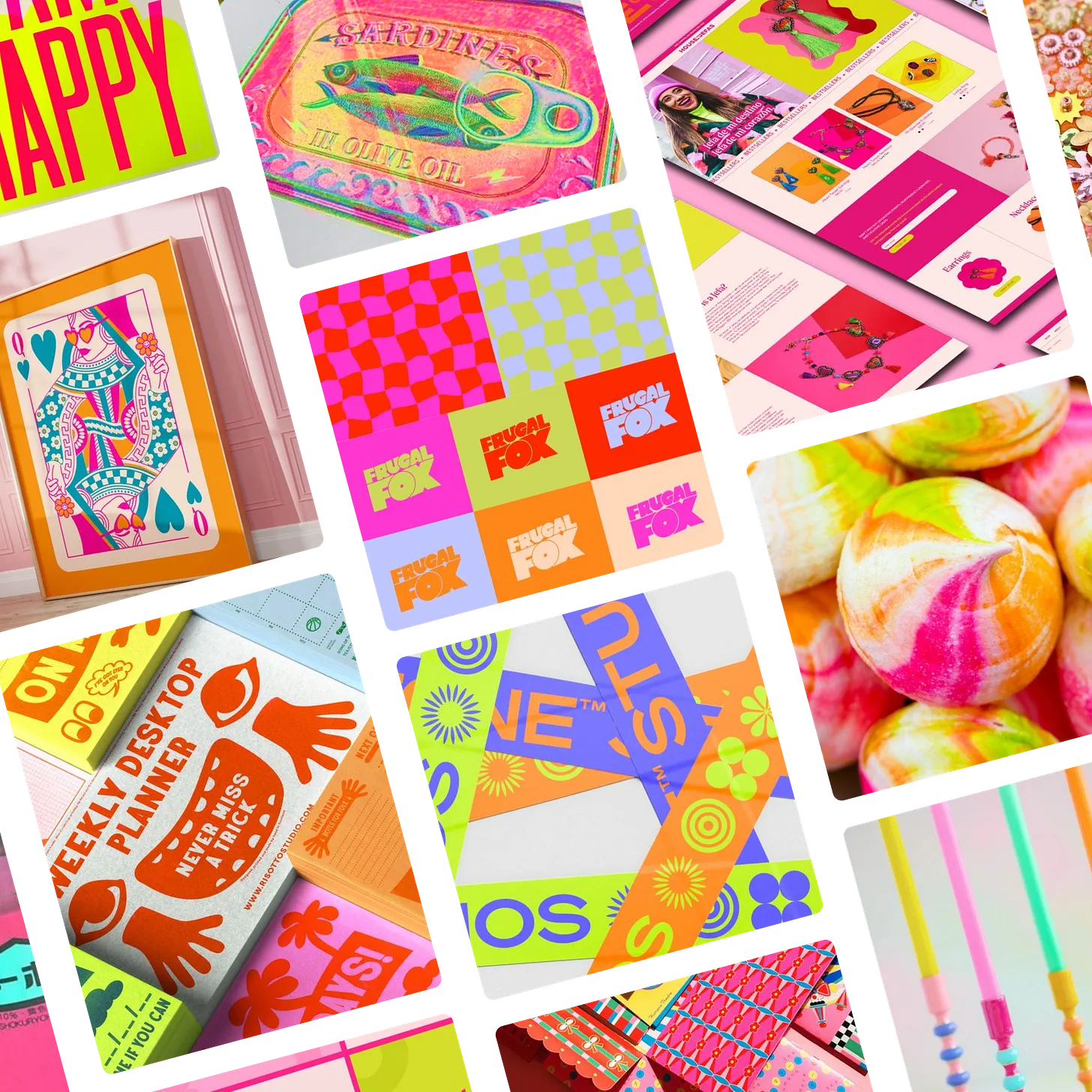
I’ll take literally any excuse to incorporate more tasteful neon into my world, and this week that excuse is the All Things Bright and Beautiful moodboard. This moodboard is sunshine for all the senses on the cloudiest day. Click here to see the original images and full board on Pinterest!
🔍 Question of the week
“What are your thoughts on the, ‘Our graphic designer quit, so here’s some Microsoft Word art!’ trend?”
UGHHHHHHHHHHHHHHH.
Does that answer your question? This trend is the absolute bane of my existence, though probably not for the reasons you think.
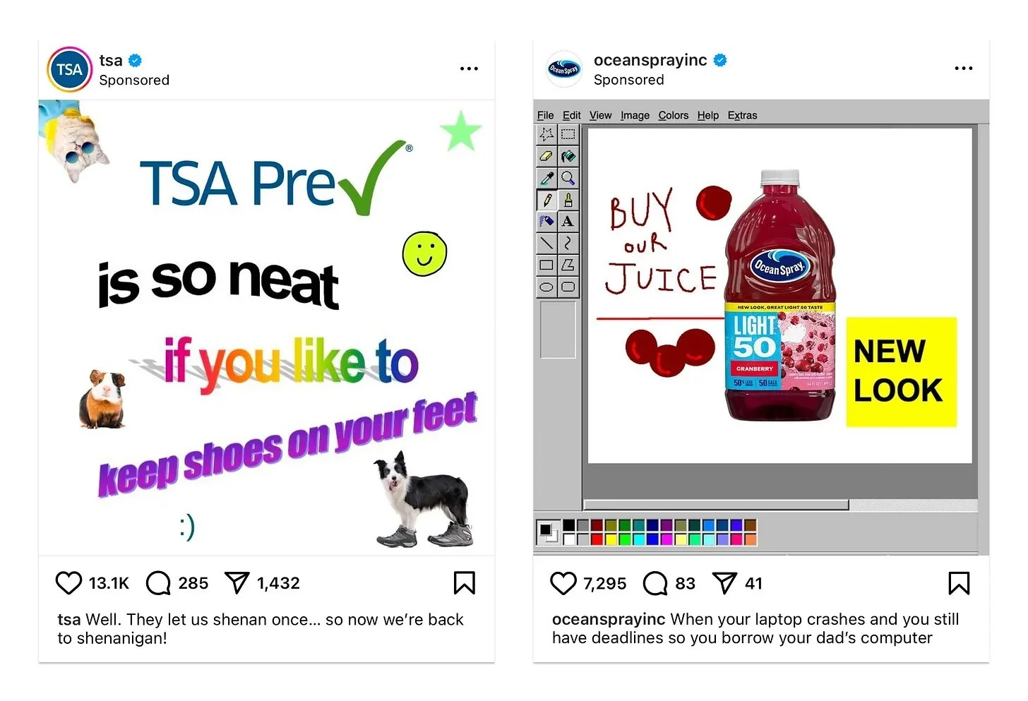
For the uninitiated, Paige is referring to an increasingly common trend, where brands create intentionally low-quality designs using commonly recognized and widely accessible (theoretically) design programs like MS Paint or Microsoft Word to create their ads, typically accompanied by some variation of “Our graphic designer quit, so here’s the best we could do.” Here are some recent examples:
In the beginning…
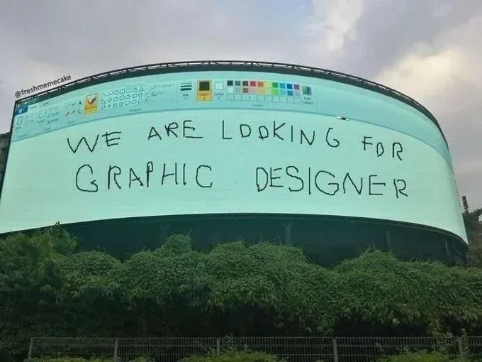
This trend has been around for a long time, and in the beginning, I actually didn’t hate it. The most famous example I know of is this “ad” (which is fake but fun):
Originally posted by "@freshmemecake” it seems, but who that is and what platform they posted it on seems to have been lost to the Internet Abyss.
Followed up by this real ad from the City of Los Angeles:
Side note—that salary range…?
Both of these are both fun and functional for a few reasons. First of all, they were original. They’re fun and silly and attention-grabbing specifically because they were fresh and new. Most importantly, they were relevant to the subject of the advertisement. They speak specifically to the problem at hand, call on the right people to solve that problem, and, most importantly, look like they were authentically created in the programs they say they were.
So why don’t the TSA and Ocean Spray versions work?
Unfortunately, as we see SO often, it turns out that just because something works well on an isolated basis, that does not mean it still works when we beat it to death with a shovel. I saw both of those ads within two days of deciding to answer this question and have seen dozens, if not hundreds, in the past few years. If everyone is doing something, it’s no longer eye-catching, and it’s also not good design—so what does it actually accomplish, apart from making you look like a follower?
The other reason these bother me is because they are so clearly calculated—and were very transparently created by graphic designers. MS Paint and Microsoft Word Art haven’t looked like this since about 2002, which means somebody had to recreate these looks (and, in the case of the Ocean Spray one, retool the MS Paint UI to fill an Instagram square). Both are also riddled with clues that an artist made them (the way the cranberries are shaded, the way the clip art is neatly cut out). If, for argument’s sake, Ocean Spray’s sole graphic designer quit the day before an ad was due (as if they don’t have a huge agency managing their brand), we all know an intern would be trying their best in Canva. It’s transparently pander-y and inauthentic when authenticity is the only thing that gives this trend legs.
Low-fi design can actually be a lot of fun, as can creative use of trends, but both depend on originality, purpose, and content. Pushing the boundaries of design? Love it. Making a trend your own? Please, please, please. Removing a trend from context and sucking the life out of it in the process? Neither demure nor mindful, but something else entirely.
Submit your burning design questions by sending me a message below. Questions can relate to design itself, entrepreneurship, workflow, or anything you think I may be able to answer. There are no limits.
🎧 Soundtrack of the week
The All Things Bright and Beautiful Soundtrack is unapologetically loud and energetic, designed to make you scream at the top of your lungs and/or get up and dance (depending on what languages you speak). Check out the playlist below, or click here to listen and save on Spotify.
🌈 My Favorite Things
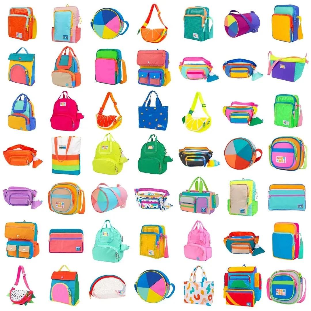
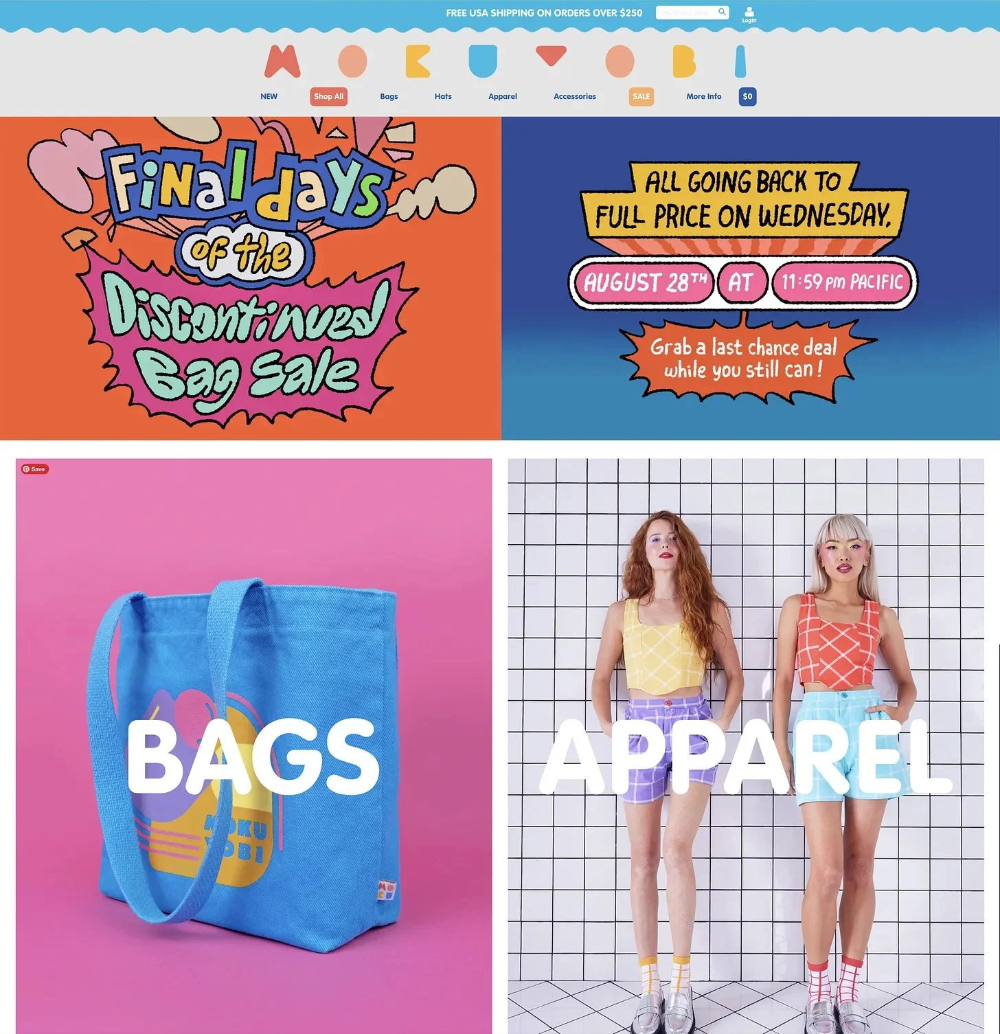
I got an ad for these bags on Facebook about 30 seconds after I decided on this week’s theme…
…and clicked to find out that their website is, no surprise, a total over-the-top maximalist delight.
While I do have a note or two about the legibility of their logo, I can’t get enough of the patterns, bright colors, and fun, dare I say, messy aesthetic. It’s great in that it perfectly represents their brand, and it’s great in that it’s great.
Check out Mokuyobi’s bags and website here. You will certainly get served the ad after you click on this link, but hey, if you’re going to get served ads anyway, let’s be real—this is one of the better ones.
🌱 Touching Grass
📖 What I’m reading: I was lured in by the truly dope cover art of The West Passage by Jared Pechaček I’m not going to lie—it really enforced the value of judging a book by its cover. On a related note, my sisters and I recently started a Bookstagram! Check it out here to follow along with our reading adventures!
🎧 What I’m listening to: Look, this is entirely against my will, so consider yourself warned, but my sister sent me this video last week, and “Egg in a Pint” has not left my head since.
🍴 What I’m eating: I’m obsessed with passionfruit, so any time I see passionfruit pulp at a grocery store in any capacity, I have to buy it. Unfortunately, I don’t have a great track record of actually making anything with it (it lasts forever in the freezer, so like, where’s the motivation supposed to come from?), but I’m determined to break the cycle this week and turn my emotional support passionfruit into an emotional support passionfruit mousse.
📺 What I’m watching: It’s Paralympic season! Wheelchair Rugby, a particular favorite, wrapped up yesterday (hard game to watch, but yay, silver medalists!), and I’m planning to use this week to catch up on track and field, and I’ve been particularly enjoying para-triathalon.
