Issue 8: Pride is a Protest
On clarity, conviction, and the reason for the season.
🪧 We’re here, we’re queer, we’ve been through this
On a public scale, Pride is very focused on celebration—on rainbows and sparkle, on killer playlists and splashy floats. This celebration is beautiful, it’s fun, and it’s extremely important. But to focus only on the party is to not only oversimplify the reason for the season, but to abandon its significance entirely. Pride began as an uprising against a violently oppressive legal and social system. Today, LGBTQ+ rights—particularly the rights of trans people and LGBTQ+ youth—are under increasing fire both in the US and worldwide. In this world, where anti-queer violence is commonplace, where so many parents still disown their children, and when queer people just trying to live are smeared by politicians and online commenters alike, it is critically important to stay grounded in why we have Pride in the first place. Pride is a party. But Pride is, and always has been, a protest first.
Protest and celebration are not mutually exclusive. Indeed, when your identity is constantly under fire, it is revolutionary to thrive in public. But change takes much more than a good party. It takes centering the needs of others, especially the people that got us here. It requires steady commitment, bravery, and often personal risk. Protest is messy, inconvenient, and scary. It’s not always loud, it’s not always public, and not even always angry, but it is often uncomfortable and always unapologetic. Protest is first and foremost a commitment that both pride and allyship cannot help but either uphold or undermine. There can be no party (and certainly no profit) that does not center on liberation.
That’s why this week we’re looking at the relationship between protest and design. The success of any design is fundamentally based on how we communicate, which impacts everything from how we make our signs to how we design our flags to how we prioritize our messages. Not coincidentally, the success of any protest is based on the same. Read on to learn how to effectively share a message, get inspired by the symbols of Prides past, and jam out to songs that embody the many forms of resistance—defiant, celebratory, and contemplative.
✨ Moodboard of the week
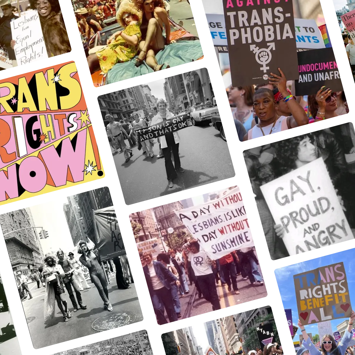
This week’s moodboard is a thank-you note to the queer protesters of yesterday, today, and tomorrow. The imagery and messaging are clear and unapologetic, and it is as empowering to see what progress has been made in the wake of protests past as it is infuriating to see how many demands remain the same. This moodboard is a lesson in the power of dedicated work and a call for brands, designers, and laypeople alike to pick up the torch and honor their legacy in action.
🔍 Question of the week
“What’s your favorite typeface and the typeface you use the most?”
Because design is fundamentally about communication, font choice is one of the highest-stakes parts of the design process. The typefaces we choose have the power to both visually transform our designs and make the difference between success and failure in how our message is received. The truth is, what I consider my favorite typeface is completely context-dependent and will always be informed by both a project’s tone and its communication needs. Because there are so many factors that make a great typeface, from legibility to personality, the specific typeface matters so much less than what it accomplishes.
This week’s theme illuminates that principle perfectly. A protester gets less than a split-second to make a point. If the sign or banner or billboard or poster or social media post does not make an immediate, clear, and engaging impression, a viewer will overlook it and miss the message entirely. Likewise, if the message doesn’t look genuine or compelling, it will undermine the conviction and urgency behind it. Personal, hand-drawn, bold, imperfect Sharpie letters are not a bug or side-effect of a handmade sign—they’re a feature.
In light of this, I have three answers to this question—a literal answer, a cheat answer, and most importantly, a set of principles for what makes a “favorite” typeface:
My favorite typeface:
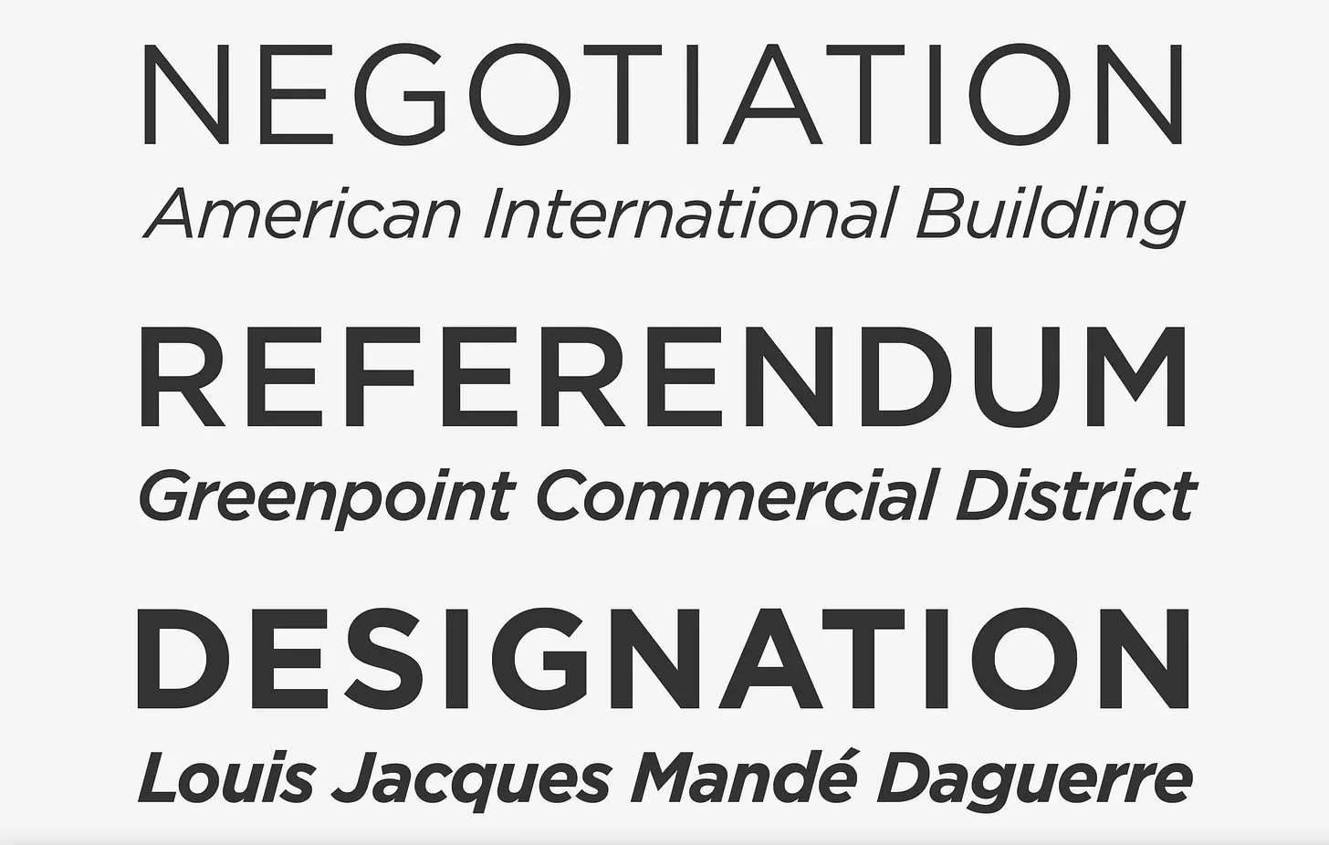
My favorite all-around typeface has been Gotham for as long as I can remember. It’s impactful, it’s clear, it’s extremely easy to read, it’s sleek, and somehow perfectly bridges the gap between accessible and inspiring. Gotham is rarely going to be the font that singlehandedly gives a project personality (although this is the font on the iconic Barack Obama “Hope” poster, as well as the vast majority of his campaign materials), but it is an incredible workhorse font. It would be my most-used font if it wasn’t so damn expensive.
My favorite type of type:
Typefaces are extremely important for usability purposes, and there are so many beautiful ones. From a practical standpoint, every brand needs fonts, and for the vast majority of projects, they’re the right call. However, the most impactful typography is virtually always customized or hand-drawn. 99.9% of the time when I see a piece of type that stops me in my tracks, I find out it’s custom work.
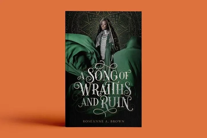
I have many favorite custom-type artists, and Jessica Hische and Martina Flor are two that never miss. Their work is always sleek, balanced and professional, but so full of depth and personality.
Type design by Jessica Hische (left) and Martina Flor (right). Image at left sourced from @jessicahische on Instagram. Image at right sourced from martinaflor.com. Also this book is the literal best. I actually totally forgot Martina Flor did the type design.
While their work is extremely refined and artistic, I think there’s something magical about custom or hand-drawn type design in general, even when it’s less flowery than this. While it’s not appropriate (or in-budget) for every project, it makes any piece of design stand out in a way a widely available font simply can’t, which is why hand-drawn letters on cardboard are more effective for protest than any printed sign.
What makes a “favorite” typeface:
Type is a constant push-pull between legibility, attractiveness, and personality. Legibility is almost always going to be the top priority unless the type is truly decorative. Particularly when conveying essential or practical information, legibility is an accessibility concern that must come first. However, typography that prioritizes only legibility risks looking utilitarian, turning off viewers, and undermining the character of whatever it is conveying. The best typeface will be easily legible but will also contain surprising details, variable letterforms, and a personality that sets it apart from other ones. While there are many typefaces I love, this is the precise reason I don’t have many go-tos. Great type design serves to set a project apart, meaning the best typeface on Earth will always be the one that’s right for the context at hand and wrong for most others.
Submit your burning design questions by sending me a message below. Questions can relate to design itself, entrepreneurship, workflow, or anything you think I may be able to answer. There are no limits.
🎧 Soundtrack of the week
This week’s playlist celebrates the extremely varied ways we protest through song. Some of these songs are loud and defiant, some of them are acts of quiet resistance, many of them have a point to make, and still others are unapologetic celebrations from a time when simply being queer (or supporting the community) anywhere was an act of resistance in itself. Click below to listen or check out the playlist on Spotify!
✏️ My Favorite Things
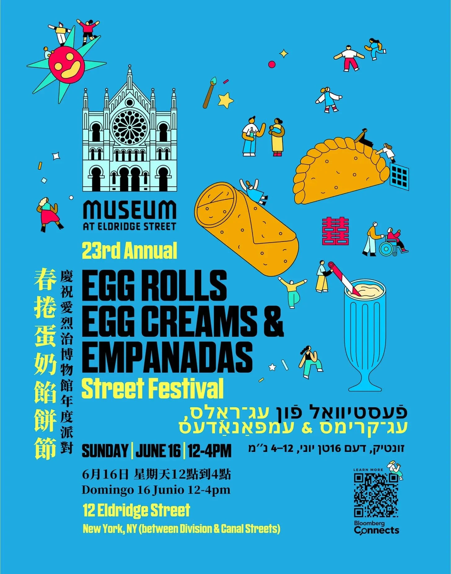
I spent Father’s Day in New York yesterday with my family and we started the day on the Lower East Side at the Museum at Eldridge Street’s Eggcreams, Eggrolls, and Empanadas street festival. I absolutely loved the event’s graphic design which was bright, whimsical, fun, and somehow managed to effortlessly blend four languages:
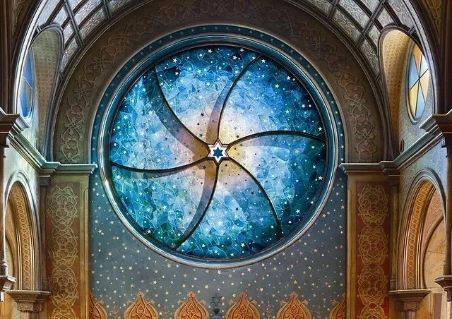
What most blew me away, however, was the private tour my sister Isabella arranged of the Eldridge Street Museum itself. The museum is housed in one of America’s first synagogues, which has been lovingly restored in recent years after falling into ruin. The restoration lovingly brought the ornate design of the sanctuary back to life, but since the front window was blown out by bad weather, they instead opted to replace it with a stunning cerulean stained glass piece that brought in the original stars surrounding it in a perfect fusion of antique and modern. No picture does it justice, so I highly recommend paying the museum a visit if you’re ever on the Lower East Side!
Images sourced from The Eldridge Street Museum.
🌱 Touching Grass
📖 What I’m reading: I just finished The Three Body Problem by Liu Cixin which was a thought-provoking commentary on humanity and one of the most gripping books I’ve read in a while. Last night, I started Mistborn by Brandon Sanderson and I fear I’m about to go down a Sanderson rabbit hole so in related news, I’ll see you all in a few years (just kidding).
🥙 What I’m eating: An absolutely killer souvlaki. Also, we had the BEST meal last night at Casa Carmen in Tribeca. I’ve been there three times in the past month or two, and they have the best Mexican food I’ve ever had outside of Mexico, plus, it’s absolutely stunning. I don’t know why this place doesn’t get more hype but if you’re in the city I can’t recommend it highly enough.
🎧 What I’m listening to: I’m months behind on Maintenance Phase, If Books Could Kill, and their respective bonus editions and I’m really enjoying catching up on all of them at once.
📺 What I’m watching: Lord of the Rings: Return of the King is in theaters tonight and you’d best believe I’ll be there.
