Issue 7: Over the Rainbow
On life after the parade and how seltzer broke my heart.
🧭 Follow your arrow wherever it points
In a world where both LGBTQ+ rights and self-worth are continually under attack, Pride is a revolutionary assertion. As a result, queer people are often expected to be Loud and Proud™. For many people, this is an empowering form of self-expression. For others, it’s a responsibility they never asked for. Importantly, for most people, it’s simply not a reflection of what it actually means to be queer.
Fundamentally, most queer concerns are human concerns—how can I live a fulfilled life? How do I build strong relationships? What on earth am I going to make for dinner this week? (No seriously, somebody, please tell me). Queerness shapes people’s day-to-day experiences to varying degrees, but there is no personality or aesthetic inherent to queerness. To assume that glitter and rainbows universally represent that experience is to overlook the true spectrum of genuine self-expression. Nobody owes anyone Pride as an action and true support from brands and designers starts with opening space for queerness as a simple way of being and validating whatever that may look like.
That’s why this week, we’re letting the rainbow take a backseat. Join me as we get inspired by family dinners and trips to the grocery store, jam out to a playlist of absolute bops that just happen to be queer, and learn how brands and designers can be inclusive without fanfare. And because I can’t help myself, I have another rant for you.
✨ Moodboard of the week
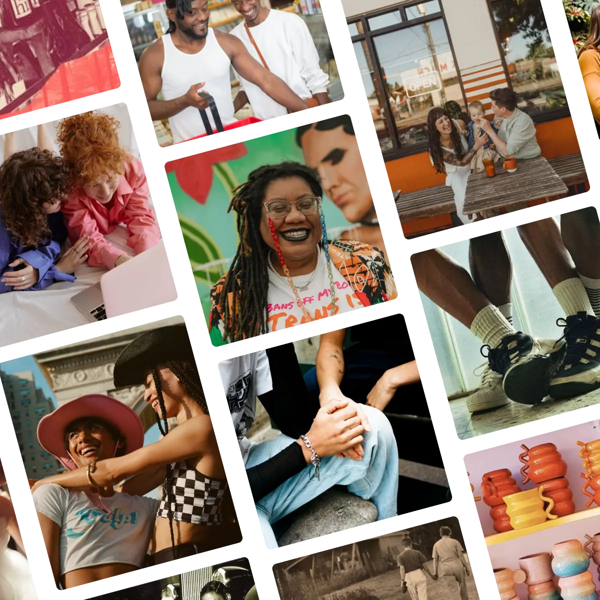
The Over the Rainbow moodboard is a glowing snapshot of queer life, highlighting queer-made pottery, trips to the grocery store, family dinners, moments in the park, and simple existence. It’s free, joyful, and, in a nutshell, beautifully mundane. Click below to view the full board and original pins on Pinterest!
🔍 Question of the week
“I’ve seen you mention accessibility in design and I’d love to know more!”
I could talk about accessible design for days. Accessibility should be the first consideration in any design project, not only because it is a legal and ethical requirement (although it is both), but because accessible design is simply better design. In the United States, accessible graphic design is governed by the ADA and encompasses many standards and guidelines for color contrast, legibility, and more. But regardless of the rules, accessibility should be governed by principle first—otherwise, we risk missing the point entirely.
This topic is particularly relevant this week because the most important principle of accessible design is genuine, unassuming inclusivity. While accessibility is fundamentally about including your disabled audience, it is important for many nondisabled people and beneficial to everyone, including brands. We will talk about some concrete rules for accessibility in a future issue, but first, it’s important to lead with some of the most important principles, whether you are a designer, someone who works with designers, or simply someone who communicates with other people:
Lead with your audience’s needs
Making design accessible begins with asking yourself who you are speaking to and what their needs are. How can you present your information in a way that is not only literally accessible but facilitates practical access? For example, good typography may mean your audience can literally read your materials, but if they don’t feel spoken to by the design itself, they may assume the message is not for them.
Never assume
Just because something seems accessible or inclusive doesn’t mean it is. It’s critically important to research and stay up to date on the latest guidelines since our eyes and instincts can deceive us. When in doubt, consult real people who can provide informed feedback and (of course) always pay them for their expertise.
Embrace the rules
You’ll rarely hear me say this, in design or anything, but it’s important to remember that the rules and guidelines of accessible design are there for very good reason. If you think of them as restrictive, this conflict is going to show in an end result that’s been twisted to fit an uncomfortable mold. If you lead with accessibility, you will be able to work alongside it and find a beautiful solution within the infinite possibilities it facilitates.
Make it effortless
Your audience shouldn’t have to work hard to understand a piece of design and, moreover, they won’t. If they have to try to figure out what you’re saying and how it applies to them, they’ll just move on. Making your design easy to interact with will often mean more effort on your end, but it makes the difference between a successful design and an unsuccessful one. This is a place where you can trust your instincts. If you think something is confusing or inaccessible, you’re right. Even if it means sacrificing the aesthetic of a design a little bit, it’s always better to err on the side of clarity for something that works.
Submit your burning design questions by sending me a message below. Questions can relate to design itself, entrepreneurship, workflow, or anything you think I may be able to answer. There are no limits.
🎧 Soundtrack of the week
This week’s playlist is a collection of some of my favorite songs that just happen to be queer. Some of them explicitly refer to queer partners and relationships, some of them just happen to be by queer people. All of them are bops. Click below to listen, or click here to view and save on Spotify!
🦉 My Favorite Things
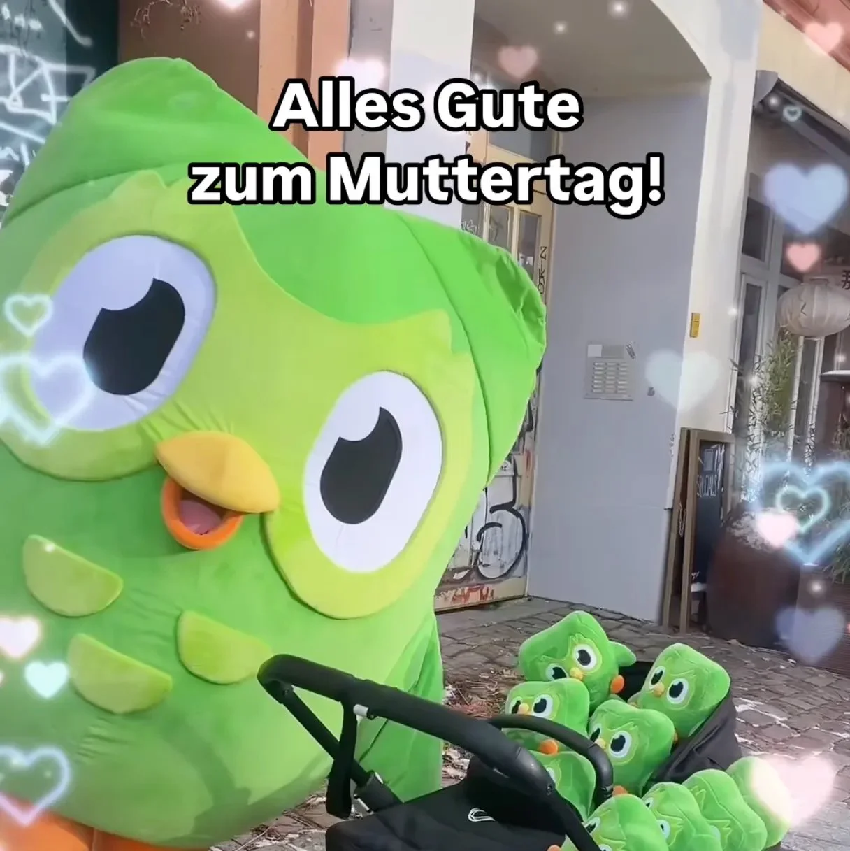
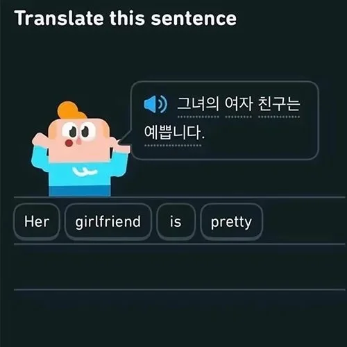
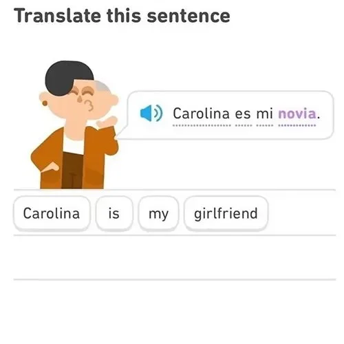
Language learning app Duolingo has always interspersed its lessons with relationships and identities of all kinds. Their owl mascot, Duo, is canonically bisexual and is also a boy mom (in that he is both a boy and a mom), while many of their other characters are also queer. Combined with a fun, approachable, and appealing aesthetic and an effortless user experience, the decision to normalize queerness year-round without fanfare is a genuinely powerful tool that many brands should learn from.
Few brands are universally crushing it in the ally department, Duolingo included. While it does offer largely free services, it is profitable enough that it should give back to LGBTQ+ causes in a concrete way if it’s going to use its support for queer rights as a marketing technique. Their recent decision to pull LGBTQ+-positive content for Russian users also fundamentally validates the “anti-propaganda” laws that led to that decision and while I can’t comment on whether continuing to operate under those circumstances is “right” or “wrong,” it’s not an act of allyship.
That said, given that bigotry is also alive and well in the US and many other countries in which Duolingo operates, normalization is one of the most important ways brands can use their power to support the community. Even as they have room to improve, theirs is an example that I would love to see more companies follow.
Still/video sourced from @duolingo (bottom 3 images) and @duolingodeutschland (top image) on Instagram.
💔 Graphic Violence
You can make a rainbow out of virtually nothing if you have to. Take 3-4 colors, put them in the right order and we’ll all get what you’re going for. After all, very few brands have a full set of ROYGBIV products at their disposal, and you’ll never catch me hating on a well-intentioned try.
Spindrift does not have this problem. Spindrift has a product line of 16-ish seltzers covering the full rainbow spectrum. What an aesthetic opportunity! It would seem impossible to mess that up…
…but they managed!
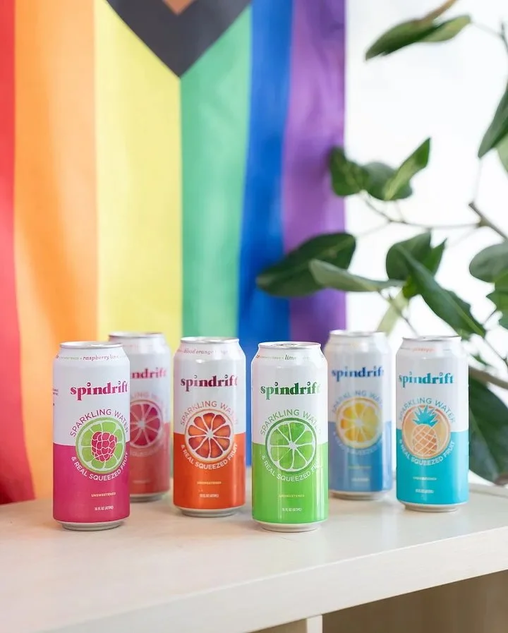
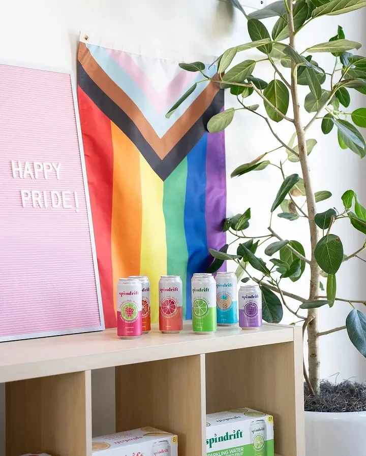
Spindrift posted these two seltzer lineups to Instagram last week and somehow managed to screw up the rainbow TWICE. I can theoretically forgive leaving out a color. But literally what – WHAT – would it have taken to put the pineapple to the left of the lemon in the first picture or the tangerine to the right of the grapefruit in the second? Also, why is the blackberry can smaller than the other ones? I can personally vouch that all of their flavors come in that size.
How do you manage to mess up your Pride post when THIS is your product lineup:
I mean are they KIDDING with this? How did the pictures above happen when this…
…is a literal possibility (as is any other combination of the colors above in the right order). How do you take an opportunity that good and fumble it that bad? And how much do you think Spindrift should pay me to orchestrate their next Pride photoshoot? (Let’s be real, I’d do it for a case of seltzer.)
🌱 Touching Grass
📖 What I’m reading: The Water Outlaws by S.L. Huang, a historical novel that takes place in 12th century China and draws heavily on martial arts culture and tropes. So far it’s delightfully queer, hilarious, gripping, and full of action.
🍪 What I’m eating: I really don’t know what to cook this week, so at the moment I’m just shotgunning Tiny Tate’s and hoping for the best. I do know that at some point this week I’m going to pay a visit to the San Martín Cemitas, the best food truck in Connecticut by a long shot.
📺 What I’m watching: I heard Queer Planet wasn’t quite as good as it promised to be, but I still want to watch it. Also, still Heartstopper. Obviously.
🎧 What I’m listening to: I’m listening to the audiobook of The Art of Gathering and, of course, this week’s playlist.
☘️ What I’m up to: My dance school’s spring recital was on Sunday, so because of extra rehearsals, I’m on day 8 of 9 straight days of dancing without a break. Pray for my legs in this home stretch.
