Issue 28: The Sad Beige Symposium
On Spotify, Saturation, and the Pantone "color" of the year.
🤎 To Beige Or Not To Beige
Hello and welcome back to the ‘Stack! I hope everyone who celebrated had a wonderful Thanksgiving, and a wonderful week recovering. SO MUCH happened while we were out, from the release of Spotify Wrapped, to the release of Pantone’s color (loosely defined) of the year, so let’s dive in.
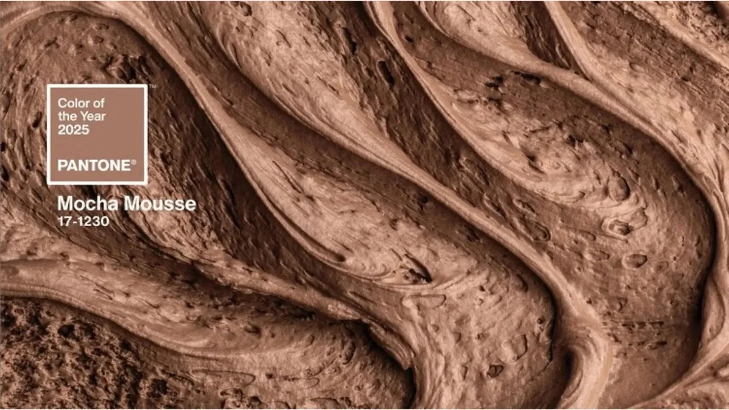
What is this. (Via Pantone)
This week, Pantone announced that their Color of the Year for 2025 is “Mocha Mousse” – a desaturated and uninspired brown that really screams “the last thing we need right now.” You’ve heard me rant about the beige-ification of design, generally accompanied by a reference to Sad Beige, coined by the incomparable Hayley DeRoche. There is a time and place for every aesthetic, and I have nothing against beige in isolation. But if this color is meant to set the tone for the year ahead, it’s important to think about what that tone represents.
Pantone’s website describes this color as “imbued with richness” and “answering our desire for comfort” by nurturing us with “its suggestion of the delectable qualities of chocolate and coffee.” On one level, they’re just wrong. Chocolate and coffee are a deep, saturated brown that would have made a beautiful Color of the Year, while this shade is wimpy and noncommittal. But on another level they’re right. The beige aesthetic is “imbued with richness” — in that a life without color has become something of a status symbol. It has become the norm for Instagram parents to beigify their children’s lives to better match their grid, while a flip through Restoration Hardware’s lookbook betrays a deep fear of color.
Meanwhile if beige “answers our desire for comfort,” I believe it does so to our detriment. It keeps us in our comfort zones rather than exploring the full spectrum of what the world has to offer. It urges us to conform to the trend of the moment rather than self-express. It’s no mistake that this aesthetic is often leveraged to spread conspiracy theories on social media — a comforting lie is often easier to digest than a challenging truth.
We’ll talk later about the tone we want to set for 2025, but at this point, I think we just have to laugh. If Sad Beige is the hand we’ve been dealt, we might as well take a week to lean in. So this week, we’re hanging neutral rainbows on the wall, listening to soft covers of our favorite songs, and bringing our own color where the color authorities will not. Read on for all this and more!
Hayley DeRoche, the genius behind the Official Sad Beige brand, is currently running a fundraiser to build new bedrooms for their kids. If you are able to, please consider contributing to the GoFundMe at this link, or by purchasing some (fantastically designed) merch at her official shop here.
🌾 Moodboard of the week
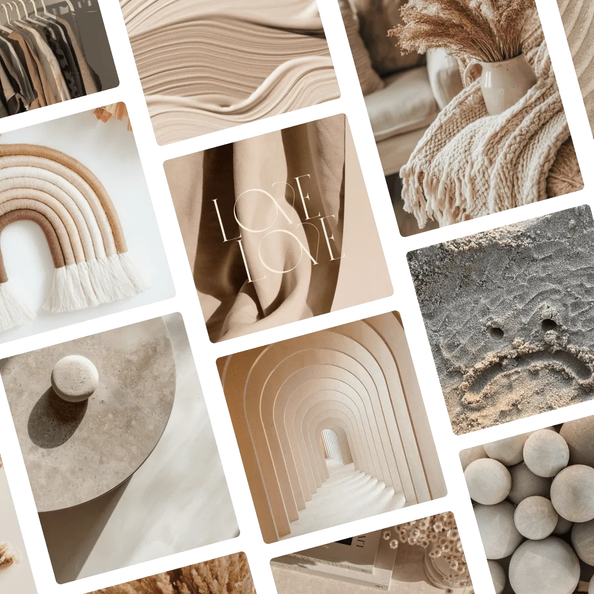
This week’s Moodboard is an Insta-ready lookbook, replete with color-free rainbows, tan bouquets, and solitary stones. It covers a broad spectrum, from tan to taupe to off-white. Click here or below to view the full board on Pinterest.
🔍 Question of the week
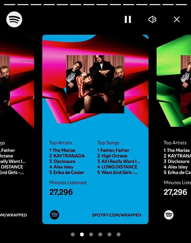
“As someone who studies communications, I’ve always hated this Spotify Wrapped layout. It looks like the songs correspond with the artists, even though they don’t, my eyes keep hopping around, and the lists are weirdly small and cut-off. What are your thoughts as a graphic designer?”
I have so many feelings about Spotify Wrapped. As someone who uses Apple Music primarily and Spotify casually (long story), I don’t give Spotify enough data to do anything useful with year-to-year, meaning the main thing I get out of Spotify Wrapped every year is the design and branding. If nothing else, it’s a fascinating study.
On the whole, Wrapped is a pretty big brand win for Spotify. It takes a lot to repackage data mining as both feature and a free advertising opportunity. Historically, they’ve managed to keep it fresh year-over-year with at least one quirky new feature (last year, they told all my friends to move to Burlington, VT!) which keeps users engaged and entertained. Wrapped works because it makes users feel understood. It makes you go, “Wow, that’s so me!” even when… yes.
With that in mind, I have notes, and your question gets to the heart of a lot of them. To begin with, I agree, this layout is terrible. I imagine the logic behind conveying all three data points on one frame is to make social sharing easier. But this layout is pointlessly confusing. There’s no hierarchy, so your eyes have no idea where to go first, and this contributes to the confusing perception that the songs and artists are somehow related which, as you note, they are not. It would take nothing to put the two lists on even slightly different levels, or make them different sizes. “Minutes Listened” could easily be a callout in the top section, freeing up space to work with. If you wanted to stack them, to give more room, you could make the album art smaller (what does that one album even represent?) or do little albums next to the song titles.
Aside from being confusing, the layout is also dry. It’s just a bunch of lists. This leads me to my other major criticism – Wrapped is getting boring. In the past year, Spotify has notably replaced many of its human playlist curators with AI, and Wrapped seems to have gotten similar treatment. Wrapped is fundamentally a template populated with our data, but it works because it feels personalized. This year’s Wrapped was notably absent any compelling quirks or any human touch – just a bunch of bare-bones favorites, basic generated art, and a brief attempt at genre mad libs (apparently January was my “Romantic Ukulele Latin Pop phase”).
As a consumer, it’s no fun (as the abundant backlash shows), but as a designer and educator, I kind of love it. Much of the trend towards AI depends on the belief that consumers can’t tell the difference, but this cynicism is its own undoing. I think companies like Spotify often forget that their job is to add value to customer’s lives, and in so doing, they open up an opportunity for those who remember. We create at the pleasure of those we create for, and it’s a powerful example not only of why design and branding matter, but why respecting your viewer matters.
Submit your burning design questions by sending me a message below. Questions can relate to design itself, entrepreneurship, workflow, or anything you think I may be able to answer. There are no limits.
🎧 Soundtrack of the week
This week’s playlist will have you running in a flowy dress through a field either towards or away from your boyfriend who doesn’t actually exist? Man, guys, Ceilings is such a sad song! This week’s soundtrack is wistful and soft and goes nicely with a candle and a quart of off-taupe paint. Preview below, and click here to listen and save on Spotify.
💜 My Favorite Things
Once upon a time, long, long ago, Pantone did its job. I will die on the hill that the last good Color of the Year was 2018’s Ultra Violet. This was six years ago, and not a day goes by that I don’t think about it (I wish I was kidding).
Not every good color has to be bold. Not every good color has to be purple. But every good color should make a statement, and the statement Ultra Violet makes is, “this color rocks.” It evokes space, jewels, royalty, bravery, energy, and commitment. It’s not the right color for every situation, but it knows what situations it is right for. It makes no apologies, and is strong enough not to be threatened if you disagree. Rather than follow a tired trend, or any trend at all, it stands as a leader and sets the tone for a rich and complex year ahead.
Images sourced from Pantone’s website, where you can also view all past Colors of the Year. Feel free to tell me I’m wrong, but I’m not ;)
🌱 Touching Grass
📖 What I’m reading: I’m on an absolutely unhinged mission to read 100 books by the end of the year (I’m currently at 86). Don’t bother telling me this is a bad goal. I’m completely aware. But I’m in it now, so I just started Animal Farm because, and I can’t stress this enough, it’s very short. Should you have any respect for me, please try not to lose it over this.
🎧 What I’m listening to: Audiobooks. A lot of audiobooks.
📺 What I’m watching: Catching up on the latest season of Bob’s Burgers, though apparently I never finished last season, so I will have to finish that first.
🥧 What I’m eating: A friend and I sort of fell into having dinner at CT institution The Griswold Inn this weekend, where I had a wild game pot pie (pheasant sausage, braised wild boar and duck confit) while being serenaded by carolers in 4-part harmony. I felt like minor nobility. I don’t imagine the leftovers will feel quite so fancy, but I’m looking forward to them nonetheless.


