Issue 27: Thank You, Next
On gratitude, turkey, and the best sandwich of the year.
🍂 Attitude of Gratitude
I’m going to be real, Thanksgiving is not for me. We talk a lot about how branding is all about authenticity and consistency, and by every measure, Thanksgiving is a complete fail. It’s built on an egregiously made up story. It’s ostensibly about tradition, but that tradition didn’t start for 250 years after a First Thanksgiving™ that was less of a party and more of a genocide. Nobody can decide if the core message is “pilgrims” or “thankfulness.” Also, turkey does not taste good.
With all that in mind, there are two things that make Thanksgiving worth celebrating: the Thanksgiving leftovers sandwich (obviously), and gratitude. As a society, we talk about gratitude so much that I find it easy to forget how important it actually is. When I’m feeling grumpy, I readily dismiss it as just another aspect of wellness culture — nice if you have time, but fundamentally overrated. I’m an editor at heart, and often instinctually focus on problems that need to be fixed. But taking time to focus on joy and successes not only reframes those problems as one piece of a larger, complex, more nuanced puzzle, but gives us the strength to take them on. Amid the many challenges we face, it helps us find joy in what we get right, and what just happens to go right. If Thanksgiving can’t focus its own brand on gratitude, perhaps it can help us refine the messages we send ourselves – not by ignoring our challenges, but by centering hope.
That’s why this week, we’re looking at design through thankfulness. We’re singing our praises to Ariana Grande’s ex-boyfriends. We’re passing the cranberry sauce and having mashed potatoes. And I’m thanking you all for the joy you bring to my life! Read on for all this and more.
🦃 Moodboard of the week
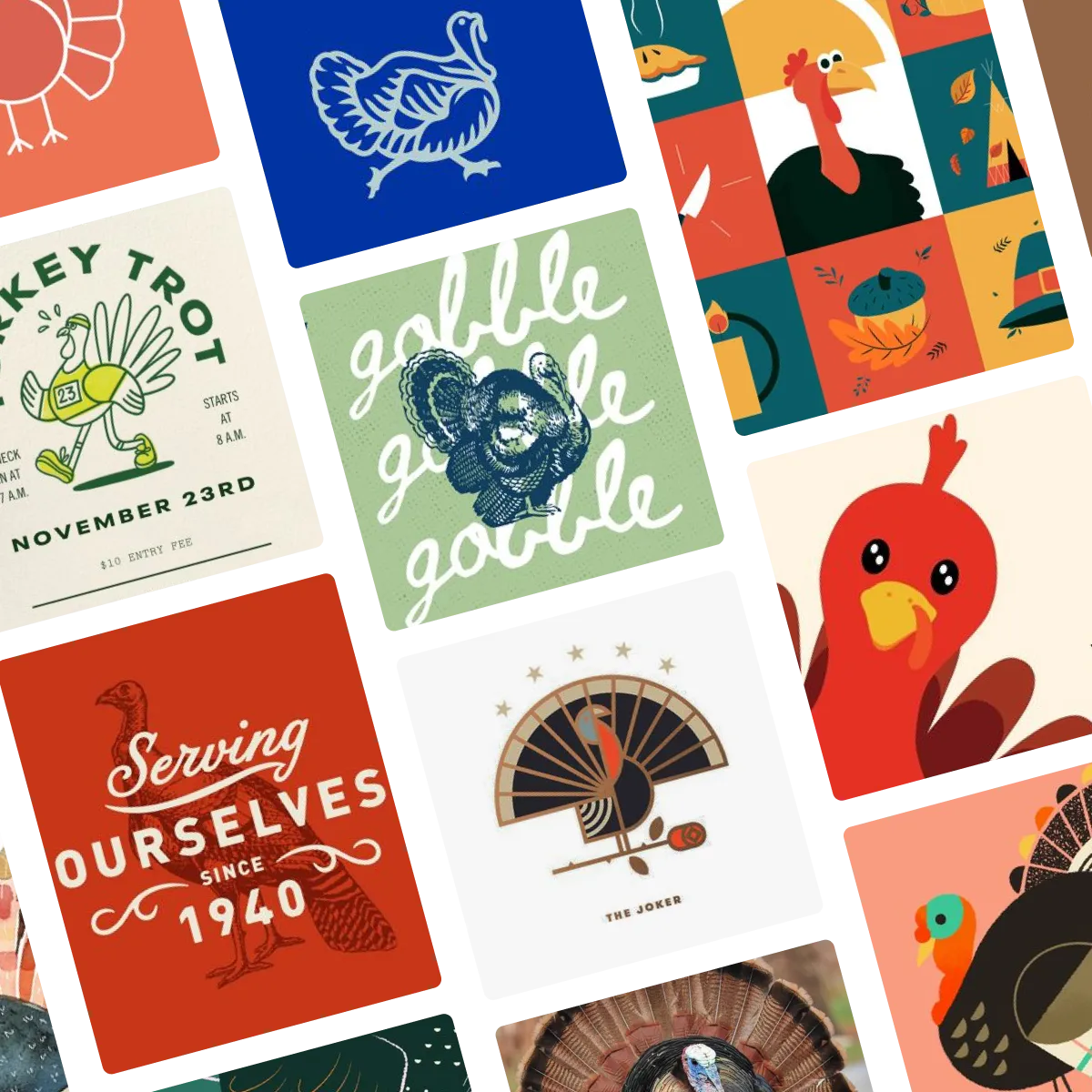
Look, so here’s the thing. Gratitude doesn’t really have a look. Well, I take that back. I’ve been on Instagram. Gratitude does absolutely have a trend-of-the-moment, sad beige look. But it shouldn’t. It’s a practice, not an aesthetic. So in the spirit of the season, here are some turkeys instead. Click here or below to view the full board on Pinterest.
🔍 Question of the week
“How do you choose the right font for a project besides gut feelings/vibes?”
Choosing a font is, in many ways, both an art and a science. There are a truly unthinkable number of fonts to choose from, and the differences that set them apart can be vast at times, and extremely nuanced at others. Sometimes the difference between a font that pulls together a million-dollar, professional brand look and one that comes off as amateur can be almost imperceptible to the naked eye – but extremely perceptible as a whole package.
Because there are so many fonts, choosing one generally starts as a process of elimination, before we get into judgment based on character and context, an up-close quality analysis, and then finally dropping it into the project, so we can tap into our gut feeling of what works and what doesn’t. Though it’s not a perfect science – and not always done in this order, here’s a general overview of the considerations that go into choosing a font:
Practical restrictions
It can be heartbreaking to find the perfect font, only to realize you can’t afford it, or it isn’t available for your use. With that in mind, the most important place to start is by hiding any fonts from yourself that won’t work for you. Licensing, technical, and pricing restrictions will help you narrow down where to source fonts and your search criteria while you look.
Sourcing
The next thing to do is pick a solid font source. Fonts can be purchased from individual foundries (type design agencies) or from directory websites. Both foundries and directory websites vary in their reputations and overall quality. Since the quality of a font can be hard to tell from a sample, I always make sure to start with a source that has a good reputation for quality. I have my go-tos, but I also keep a running list of favorite foundries and directories, since frankly it’s very hard to remember what’s out there!
Font Type
Different font-types — serif, sans-serif, script, etc. — all come preloaded with associations. Serif fonts can look very professional or elegant. Serif fonts can look very sleek or utilitarian. Some font types are generally easier to read, while others have more character. These associations are not universal within a given group, but if a give association speaks to your project’s needs, it can help you decide where to spend most of your time. (I actually have a project coming out soon that will helps teach, among other things, the differences between these associations! Stay tuned!)
Character
At this point, character starts to come in. Each font has subtle differences — differences in line-weight, curves, curlicues, smooth or sharp edges, and much more — all of which will give the viewer a different implicit vibe. Rounded corners and curves are generally playful. Chunky scripts tend to look retro. Analyzing character and how it applies to your project takes a combination of research and gut instinct. When you look for inspiration, or similar projects to yours, certain styles may come to the forefront, which you may want to prioritize. That said, if you want to stand out, it can be helpful to put a twist on the common look, and sometimes you do have to rely on vibes.
Technical analysis
Once you’ve picked your favorite fonts, it’s time to get a little up close and personal. Lots of fonts are conceptually fun, but don’t quite hit in context. Regardless of style, a good font will have refined lines (even if they’re purposefully rough), evenly-spaced letters, and an internally-consistent look. I use this, and a side-by-side comparison of all my options to narrow down my overall selection to a workable number to play around with.
Dropping it in
Once I can’t narrow them any further, the last step is to drop the fonts into the project. If I can reasonably say that a font is technically sound and has a character consistent with the energy I want to give off, at this stage I give myself over to instinct and vibes. This is all about how it feels. A font can be objectively perfect, but just not quite work when you drop it in. Sometimes a font looks right, but the message it sends is off brand. That’s why it’s important to do your research first. If you start with a base list you know will work, then you can reasonably trust your instincts to tell you the right path.
Submit your burning design questions by sending me a message below. Questions can relate to design itself, entrepreneurship, workflow, or anything you think I may be able to answer. There are no limits.
🎧 Soundtrack of the week
This week’s soundtrack is showing its appreciation, either explicitly or implicitly, at times with snark, but always genuine at its core. It spans genre and theme, and reminds us how much beauty there is in the world, even when times are tough. And it ends with Ashokan Farewell because it wouldn’t be Thanksgiving if it didn’t. Preview below, and click here to listen and save on Spotify.
🦢 My Favorite Things
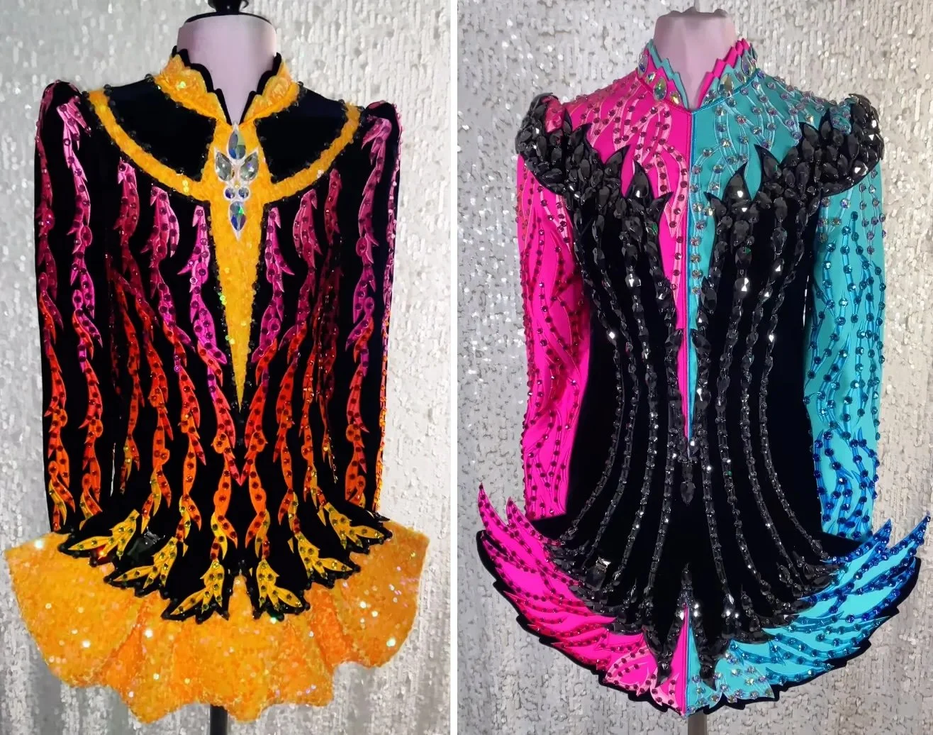
As you guys know from last week, this past weekend was the New England Region Oireachtas (Irish dancing championship). Beyond the dance itself, I love how design centric Irish dance is. Irish dance dresses may be outlandishly expensive, but at least they are sparkly beyond belief, and it’s so much fun to watch the fashions change every year.
Designs by Elevation, from @elevation_design on Instagram.
But beyond the crystal-encrusted solo dresses, there is such a special place in my heart for school design. Every school in Irish dance has its own unique style that translates not only into their school branding but also their team costume design. Many of these designs are based on Celtic patterns of drawn from the Book of Kells, but modernized to create something unique to the school.
My school’s logo, from lenihanirishdance.com
These designs are such a wonderful nod to both the tradition and evolution of Irish dance, while helping solidify each school as the family it is. It’s a very different kind of branding from what I usually do, and seeing logos like this one not only fills me with pride for my school and sport, but gives me so much perspective on the various ways we create beauty.
🌱 Touching Grass
📖 What I’m reading: I’ve been reading Wrong: How Media, Politics, and Identity Drive Our Appetite for Misinformation by Dannagal Goldthwaite Young – a fascinating analysis of how conspiracy theories and mis/disinformation take hold, and how it can get tied up in identity. I’m about halfway through and so far I highly recommend it!
🎧 What I’m listening to: The new Wicked Soundtrack.
📺 What I’m watching: Every Bob’s Burgers Thanksgiving episode. And Wicked, on Wednesday.
🥪 What I’m eating: Thanksgiving leftovers sandwiches, obviously


