Issue 22: Book by its Cover
On bookworms, broken rules and responsible judgment.
📖 Reading is What? (Fundamental.)
I don’t think it will surprise anyone to know that I was a bookworm child. I can think of multiple “playdates” as a kid that consisted of me and my best friend reading in parallel, and I think I’m the only kid I know whose mom repeatedly told her to stop reading because I hadn’t seen the sun in days. Like so many people, I stopped reading almost entirely after high school and college. I was so burned out, but more significantly, I left school with the sense that reading was a chore. I felt I was supposed to read for enrichment or at least inspiration, but any book that fit that bill sounded exhausting. If I couldn’t get up the energy to read those, what was the point?
It’s easy to get so hung up on the idea of “supposed to” that we miss the spirit behind the rules we set. We’re supposed to read books that enrich us, but what if that leads to us not reading at all? We’re not supposed to judge a book by its cover, but what if that cover was specifically designed for people who would like the book? It’s the same in design - we’re supposed to follow the rules of good design, but what do we do when those rules undermine our goals?
When I finally did get back into reading a few years ago, it was cover design that lured me in (classic). The more I let go of the rules that governed my reading experience, the more I found myself reading — and the more enrichment and inspiration I found from every book I read, whether it was a Pulitzer Prize winner or an anachronistic Edwardian romantasy. Abandoning the “right” path to my destination was essential to reaching it. And the more I thought about it, the more I saw that principle show up in work and beyond. Getting hung up on the right answers was the quickest way to stifle creativity, cut off solutions, and keep myself stagnant.
That’s why this week, we’re looking at design through books and covers. We’re taking a look at beautiful book design, softly playing classical music in the background to get us in the zone, and talking about when we can – or even should – break the rules. Read on for all this and more!
📚 Moodboard of the week
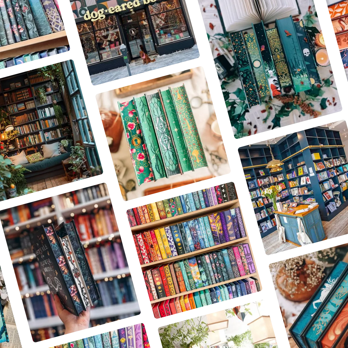
This week’s moodboard is a celebration of book design innovation. On a practical level, I’m actually not sure how I feel about the sprayed edges trend — if books are meant to be found and read, why incentivize keeping them on a shelf wrong-side-out? But on an aesthetic level, they’re incredible. I’m obsessed with the trend towards bright colors in book design, and endlessly inspired by the intricate ornament that has become a signature of covers today. Click here or below to view the full moodboard and original images on Pinterest.
🔍 Question of the week
“Do you think there’s ever a good time and place to intentionally use “bad” design?”
YES. I’m so glad you asked, because I think about this all the time, and I have been dying for an opportunity to talk about it. One part of my designer self — the one that found her way to this field in the first place — wants everything to be pretty and “correct” all the time. But the more professional part of my designer self knows the full story is much more complicated. There is absolutely a time and place to use bad design. Let’s explore!
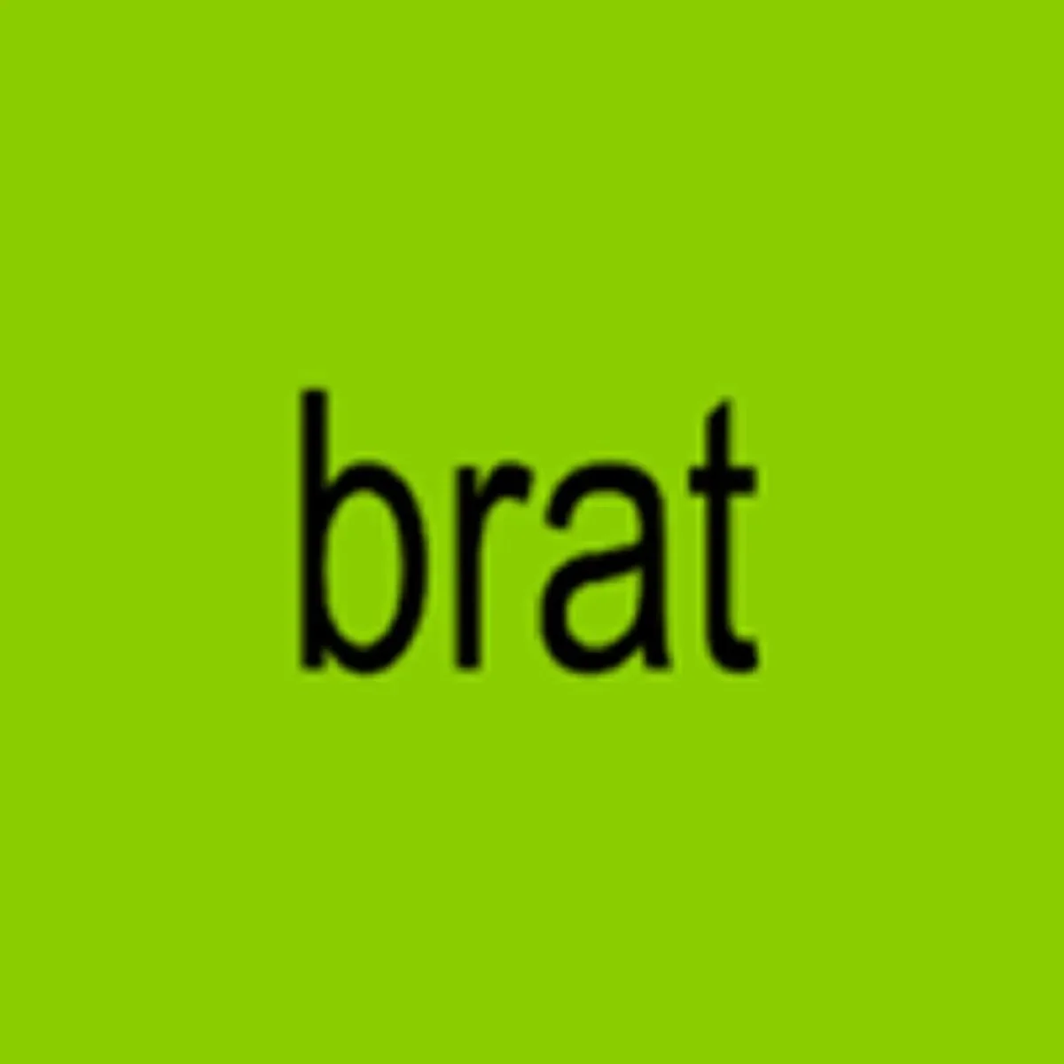
Probably the best known example of good bad design in recent years. Source.
To begin with, let’s define “bad,” since it can mean a few different things — all of which can be appropriate. A bad design can…
…ignore the principles of good design.
For example, the layout might be crowded, or include too much information.…not appeal to you as the designer or client.
A design may fill a look that someone else may find appealing, but you see as dated or tacky or simply bad.…be objectively ugly.
With the full understanding that beauty is in the eye of the beholder, there are some looks that just don’t look pretty, and aren’t meant to.
Any of these might be appropriate in the right context. For one thing, design principles are not the only priority in project development. Sometimes, the communication priorities of a project are incompatible with “good” design. If you have certain information that MUST be communicated (i.e. details for an event) and only a small amount of space to communicate it in, your design is probably going to be cluttered. In an even more practical example, sometimes budget also doesn’t allow for good design, and it’s more important that you produce something than something correct.
But logistical restrictions aside, I actually think that, given all the freedom in the world, there are many situations where choosing bad design is the right call. Design is generally about appeal, but appeal isn’t the same as beauty, and sometimes even just following good design principles can turn people off. There are people who intentionally reject “nice” design because they find it elitist or assume whatever it’s promoting is expensive. There are also industries and businesses that are better served by ugly design and branding. If an HVAC company has tacky ads and a ridiculous logo, I know they’re likely to be a friendly local business that will work with me if there’s ever a problem with my system. If my accountant’s branding is dry, I know they’re no-nonsense and will do my taxes right. The point of design is to accurately and immediately represent a product or message, and “good” design does not always accomplish that.
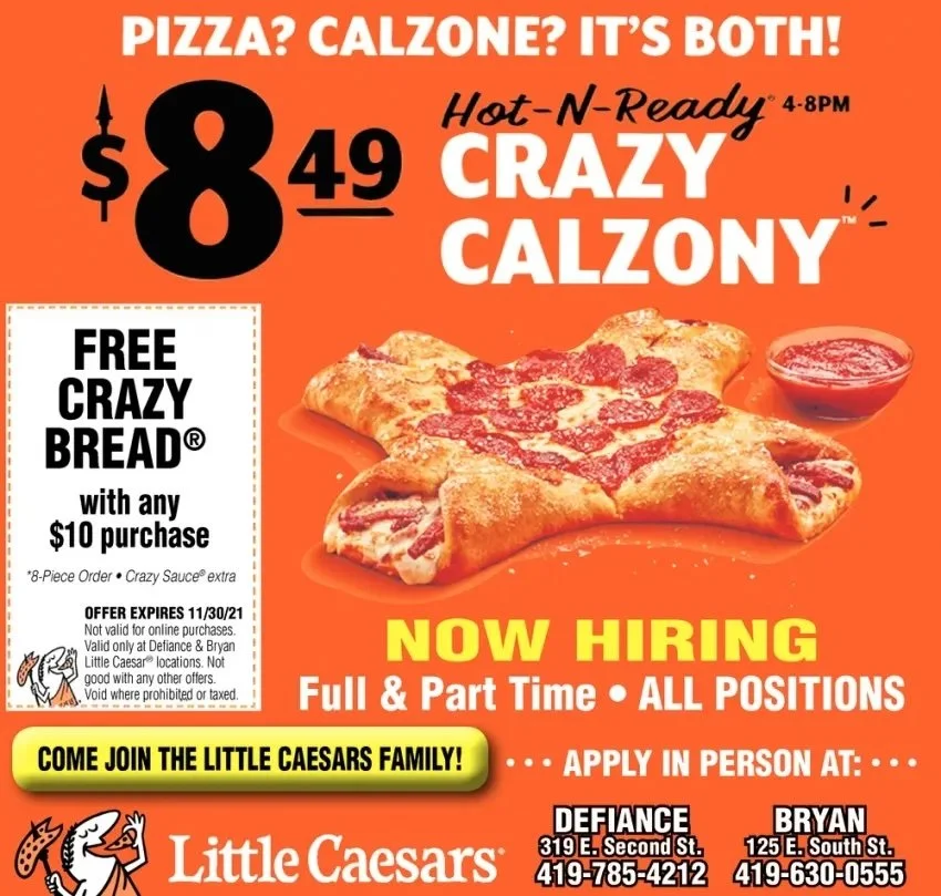
A brand I often use as a great example of this is Little Caesar’s. Little Caesar’s main claim to fame is being inexpensive and quick. They’re not trying to pretend they’re the best pizza. So why would they brand themselves as the best pizza? Their colors are garish, their logo is cheap-looking. Their stylization is dated. There are crumbs all over the ad for some reason? But it tells you exactly what they are, and if you are looking for quick and cheap pizza, you know you are more likely to find it there than anywhere.
Overall, I still think most brands are better off prioritizing good design – even if “good” just means clean, uncluttered, and appealing to look at. But as with most things, it’s not universal. When pretty design undermines your message, it doesn’t work. Conversely, when bad design reaches the people it needs to reach and does its job effectively, you may find it’s good design after all.
Submit your burning design questions by sending me a message below. Questions can relate to design itself, entrepreneurship, workflow, or anything you think I may be able to answer. There are no limits.
🎧 Soundtrack of the week
This week’s soundtrack is inspired by the playlist in a cozy café you’ve gone to read in on a rainy fall day. If you really want to do it up, pair with some thunderstorm sounds and a pumpkin spice chai. It’s word–free, non-distracting, and mostly classical, but it doesn’t take itself too seriously. Preview the playlist below, or click here to listen to the full thing on Spotify.
🍜 My Favorite Things
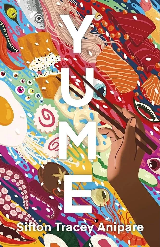
I never buy books just for their covers, but I’m not ashamed to say I’ve often been drawn in by a cover first. I won’t lie — it’s lucky for me that the topic and writing in Sifton Tracey Anipare’s Yume do appeal to me because with a cover like this, I would have bought it anyway.
This book — a fantasy about a young Canadian Black woman teaching English in small town Japan, contending with racism, literal monsters, and the possibility of leaving a job she loves — is supposedly cinematic, weird, dream-like, and food-driven. The colorful and detailed cover stands out from any crowd, but also perfectly represents the story and style described. The more you look at it, the more you see, and I’m inspired in a different way every time I look at it.
You can buy Yume here.
🌱 Touching Grass
📖 What I’m reading: Last week, my mind felt a bit too all over the place to read full sentences, so I picked up Mary Oliver’s Devotions hoping poetry would capture my attention a bit better. It was an admittedly ridiculous perspective to think poetry would be easier to read by any definition, but it also seems to have worked, so that’s nice!
🎧 What I’m listening to: I have so many artists I love but forget about and then get to rediscover. This week it’s been Florence and the Machine, and I’ve been loving listening to their complication album Under Heaven Over Hell, delightfully stylized as, “UH OH.” No notes.
📺 What I’m watching: The Great Britain Championships for Irish dance took place this past week, and some of the best dancing videos I’ve ever seen have been making their way through my Instagram feed. It’s a joy to behold, especially with Oireachtas season (the New England Regional Championships) closing in.
🥘 What I’m eating: It’s time to make my favorite confit chickpeas from Rosie Kellett of The Late Plate. I’m sure I’ve recommended this recipe before, and I certainly will again.
🇺🇸 What I’m doing: Early voting has started by me, and if you live in the US there’s a good chance it’s also started by you. Go vote ASAP and send me a picture of your sticker for bonus points!


