Issue 21: Down the Witches' Road
On spooky season, the paths we choose, and the deal with Coke Zero.
🔮 Aura All Along
After a few weeks leaning into coziness, melancholy, falling leaves, and country drives, I think it’s fair to say spooky season is well and truly upon us. I’ve put together a good Halloween costume for the first time in decades (remind me to show it to you), and as I’ve told anyone who has stopped to listen to me for half a second, I am LIVING for the weekly Wednesday releases of Agatha All Along — the campy, queer, witchy, magical, delightfully spooky, and perfectly purple Marvel miniseries of my dreams. Season of the Witch™ isn’t exactly my signature aesthetic, and if there’s one thing I love more than a story well-told, it’s an opportunity to look at the world through new lens — and an opportunity to talk about it with all of you.
The show finds our protagonist and her ragtag coven on The Witches’ Road — a path toward whatever the walker desires most, via a series of risky trials. I’m not sure if it was meant as a metaphor, but it’s deeply resonant. So many of us have goals for ourselves, our careers, our brands, or our impact on the world that terrify us both in themselves and in the path to success. It’s naive to think the pursuit of any big goal is without genuine risk, and yet the result of staying put is a risk in itself. Are we comfortable with our decision not to walk the road if it means closing off possibility? Are we comfortable with our decision to pursue those possibilities, knowing what it takes to make it to the end? There is no one right answer, but we provide our own answers daily, whether or not we’re aware of it — and whether the decision at hand is as small as picking a color scheme, or as big as figuring out what we want to be when we grow up.
That’s why, this week, we’re walking Down the Witches’ Road. We’re getting inspired by twisted trees and purple glitter. We’re facing our mistakes and conjuring up new solutions. And above all, we’re claiming our power like witches we are. Read on for all this and more!
💜 Moodboard of the week
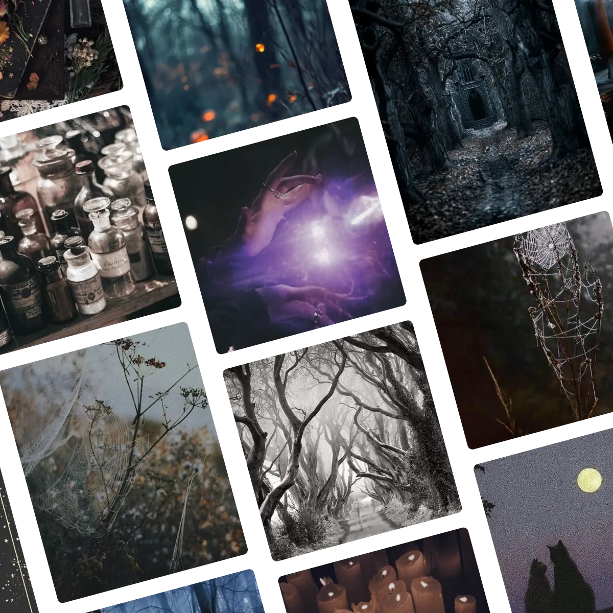
This week’s moodboard puts full emphasis on “mood.” It’s dark and stormy, never forgetting that pop of purple. It finds the spooky and surreal in every day, with a little bit of real magic to tie it all together. Click here or below to view the full moodboard and original images on Pinterest.
🔍 Question of the week
“What’s the deal with Coke Zero?”
I talk a lot about Coca-Cola not because I’m a super fan, but because few brands illustrate the big principles of branding so clearly. How do you stand out when literally everyone shares your brand colors? Commit to YOUR red and white and never change them. How do you ensure your logo is so recognizable you can identify it from a tiny cutout? Pick something great and keep it for 138 years. Even on the one occasion Coke royally messed up (New Coke), they managed to illustrate by omission, demonstrating both the pitfalls of innovation for innovation’s sake (a trap so many brands fall into) and the value of walking back your mistakes, as embarrassing as they may be.
But of course, brands shouldn’t necessarily stay the same forever — even when they’re iconic. Not only do times and preferences change, but sometimes there is a true opening for innovation. Case in point, Diet Coke tastes terrible (I said what I said). And it is also iconic and widely-loved. So what’s a brand to do in a situation like that?
I think Coke Zero (or Coke Zero Sugar, as it is now called), is one of the most fascinating brand case studies, because it illustrates not only branding done well but, just as much, how to deal with a branding challenge that’s much bigger than it should be. So often, when a company releases a product that is functionally the same as one it already makes (in this case, a zero-Calorie version of its signature soda) the instinct is just to replace it with a “new and improved flavor” label. After all, who would object to a diet soda that tastes exactly like the original instead of a 3d-printed knockoff?
Coke won its first battle by knowing that lots of people would. New Coke didn’t just fail because it was worse (though I’m sure it was). It also failed because it was new. Coke Zero met a genuine opportunity, but only alongside Diet Coke, not as its replacement.
But this solution creates a new problem: when two of your products are functionally so similar, how do you distinguish them from each other? You can explain the difference to people, but nobody is paying attention. You have to assume that all you have to work with is your name and your design. Branding isn’t just important in this scenario, it is everything.
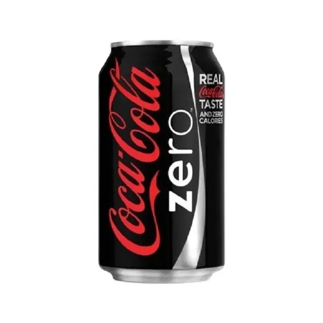
As always, Coke provides a perfect case study through its initial failure and subsequent success. Coke release this product with the name Coca-Cola Zero, a black can, and a callout that says “Real Coca Cola Taste and Zero Calories.” Instinctually, it doesn’t seem awful. The black can is new, the “zero” shows that it’s not Diet Coke, but is a zero-calorie product, and the callout explains what it is. But it missed the mark. For one, people clearly took the “Zero” in the name to mean “zero flavor.” We can sit here and say that’s silly (and I think it is), but if people feel your name implies that your product is “less than” in any way, you’re better off accepting that than arguing (particularly if your main selling point is having more flavor). To that end, people clearly weren’t reading the callout. And if the black can worked well within the Coke color scheme, it wasn’t doing them any favors either.
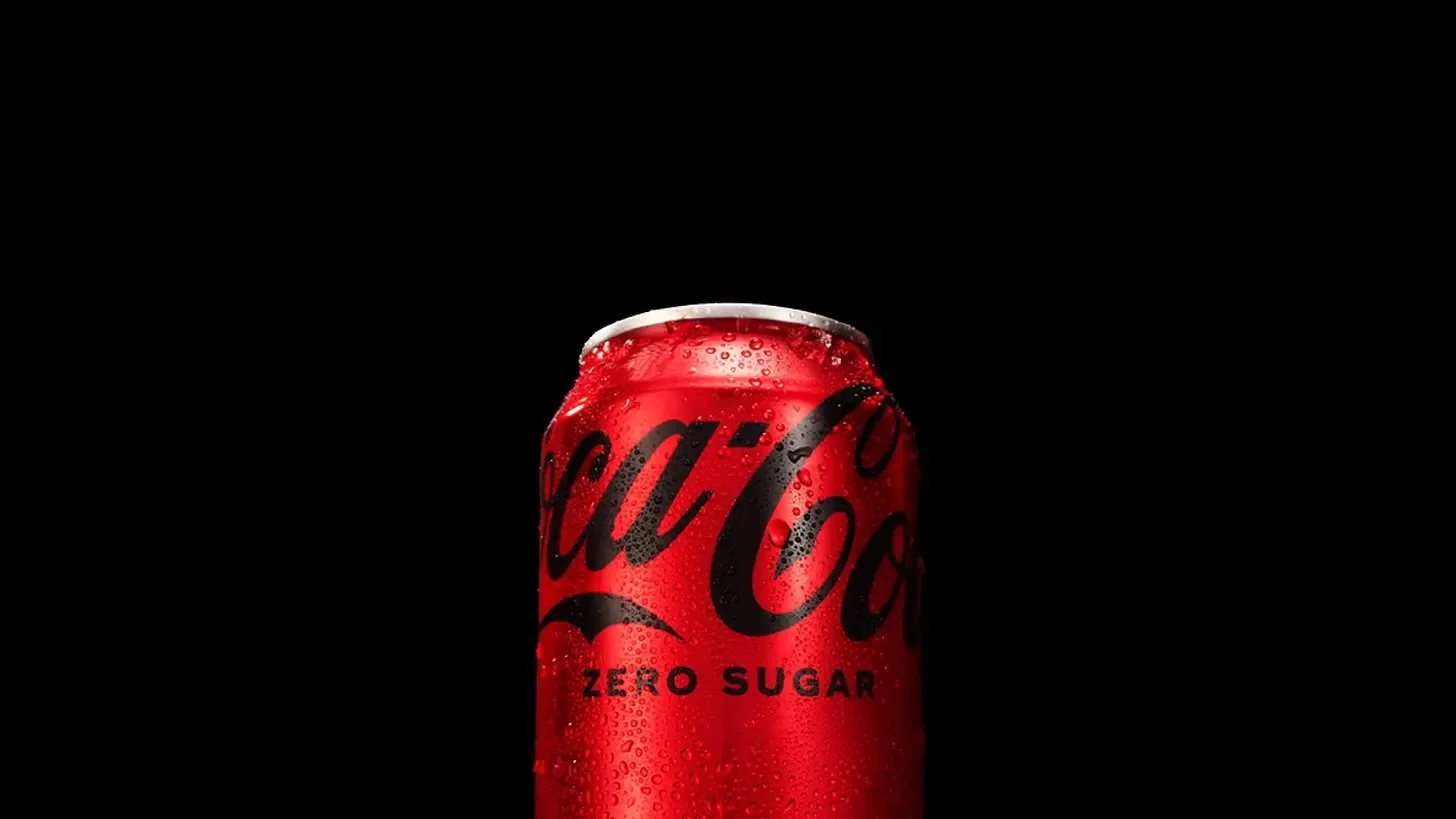
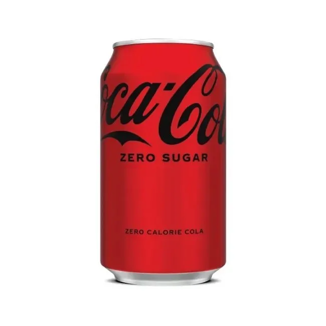
Branding is Coke’s main asset, and the original Coke Zero design didn’t lean hard enough into it. For the updated product, Coke changed the name to Zero Sugar to make the “zero” reference unambiguous. But its biggest win is in the can. Where Diet Coke has its own distinct design, Coke Zero Sugar uses Coca-Cola’s original branding, but with black instead of white to distinguish it from its full-calorie counterpart. With the black text doing all the necessary work to both visually set it apart and capitalize on any equity built from the first iteration, the analogous design does more to make its point than any explanatory text ever could. This is the same Coca-Cola you know and love - only different!
Clearly this hasn’t solved all its problems. The fact that you’re asking this question at all means Coke still has work to do to make up for its initial failure. But it has also set this product on the right track, making it the company’s fastest growing product.
Submit your burning design questions by sending me a message below. Questions can relate to design itself, entrepreneurship, workflow, or anything you think I may be able to answer. There are no limits.
🎧 Soundtrack of the week
This week’s playlist is dark, mysterious, complicated, and above all powerful. It welcomes in the spookiest season. It also proves two of my important musical theses – that Taylor Swift is at her best on a soundtrack, and that no playlist can have enough Rhiannon Giddens on it. Preview the playlist below, and click here to view the full thing on Spotify.
✨ My Favorite Things
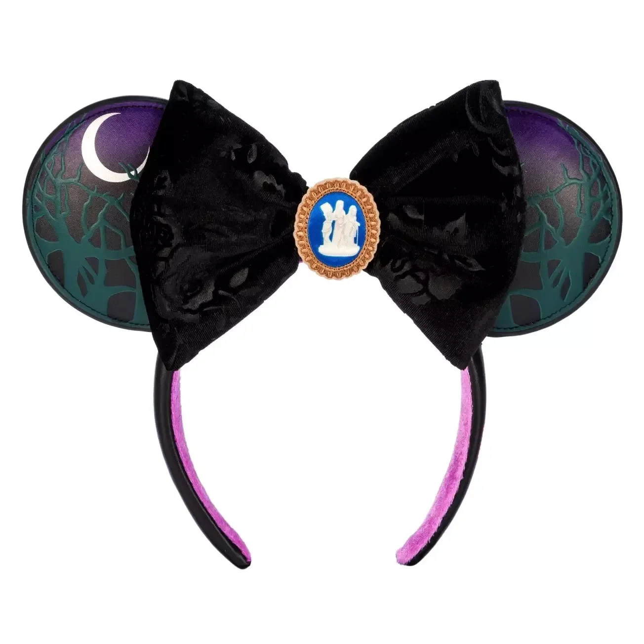
The costume design on Agatha All Along – and the deep layers of thought behind every decision – have been deeply inspiring to me, even as a non-fashion designer. I had been planning on talking about that this week (and I highly recommend checking out costume designer Daniel Selon’s Instagram page, particularly if you watch the show). But this morning, I found out about the new Agatha All Along Mickey ears and all my plans went out the window.
I’m not actually a big Disney fan on the whole (no shade, it’s just not for me),4 but I love how Mickey ear design manages to so cleverly and consistently distil the essence of huge, complicated aesthetics. From the embroidered Three Goddess brooch to the burned-out rose velvet, this design is such a win – a pop-y and whimsical take that does equal justice to the beauty, detail, and camp of the source material.
Ear picture sourced from The Disney Store.
🌱 Touching Grass
📖 What I’m reading: I just started Swordcrossed, the newsest release from Freya Marske. She wrote one of my all-time favorite series, so I’m really excited to dive into this one in the coming week.
🎧 What I’m listening to: Talisk, a contender for my favorite band, just released their first live album, Live at the Barrowlands. Not only are they incredible live, but a few of my friends actually danced at that show, so I’m excited to give it a full listen today.
📺 What I’m watching: Abbot Elementary is back! This show is truly carrying the whole institution of network sitcoms on its back right now, and if you haven’t watched it yet, you need to fix your life and choices.
🍨 What I’m eating: For some reason, I have a metric ton of leftover ice cream in my freezer. As problems go, it’s pretty much the best one I’ve ever had.
