Issue 4: Calm TF Down
On taking a deep breath, taking a step back, and taking in the world around us.
🌊 Breathe in, breathe out.
These past few weeks I’ve felt like no matter what I spend my time doing, something else needs my attention more. If I’m writing, I’m not designing. If I’m designing, I’m not creating educational content. If I’m creating educational content, I’m not networking. If I’m networking, I’m not getting my roots touched up (I did finally get my roots touched up). I’m not a calm person by nature, so in a funny way, this is my comfort zone. It’s so much harder for me to take a step back and relax than it is to keep pushing forward. If I got to the end of my to-do list, I wouldn’t know what to do with myself.
As a designer, I’ve learned that this is a dangerous and tempting trap. Creativity doesn’t respond well to force. We need to make space for the right answers to find us. We need to open our eyes to the world around us without expectation or judgment and allow it to inspire us at its leisure. Most annoyingly, we can’t fake it out. We can’t relax for the sake of productivity. We have to relax for real.
I have a sneaking suspicion this holds true across career paths. That’s why this week, we’re calming the heck down together. Do we have the time? Debatable. But nobody’s week is going to get worse with Sam Cooke and a picture of the ocean. Join me as we get inspired by snow, sea, and frosting swirls, learn how long it takes to get a design just right, and make space for just one quick rant about oat milk.
And if you’re so inclined, share your favorite relaxation technique in the comments. I have a feeling it will do us all some good.
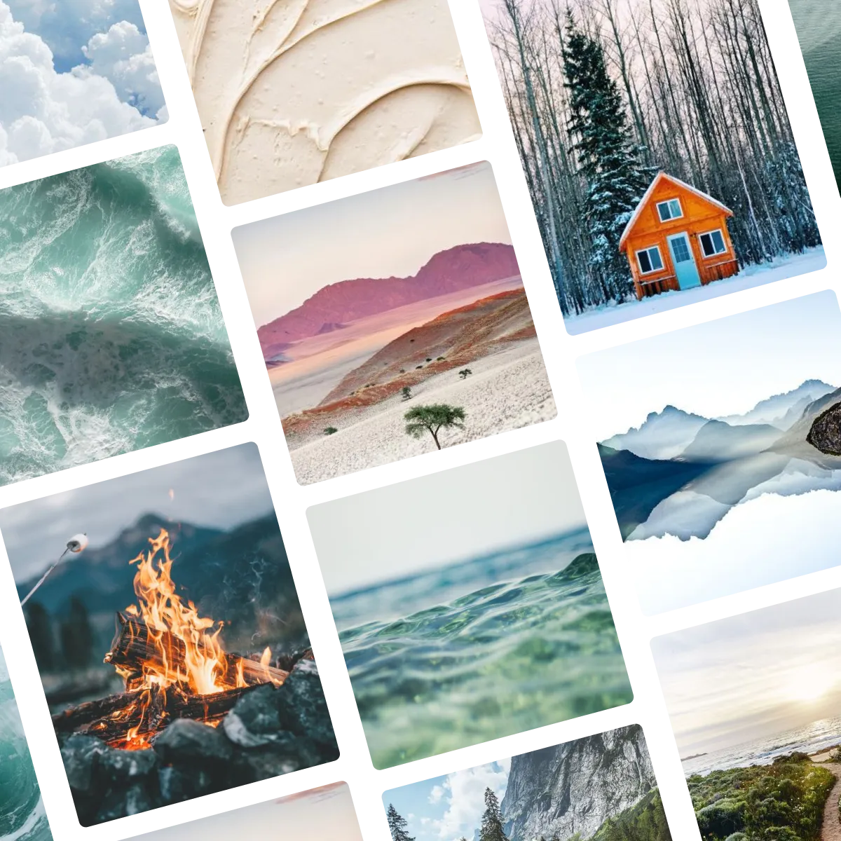
✨ Moodboard of the week
This week’s moodboard is an ode to stillness. While some of these images are inherently still, I find the ones that center me most are the ones in constant unpredictable motion that help me find stillness in myself—the campfire, the ocean, and the rolling clouds. Is that irony? I can’t remember. But either way, I like it.
🔍 Question of the week
“How many iterations do you go through before landing on a final design or simply losing it?”
I think most designers are on their own journey to answer this question. This will vary so much by the type of project, as will the definition of “iteration.” For a logo project, we may go through two or three rounds, each requiring brand-new concepts. A booklet may end up with 10 revision rounds as content gets updated on the client’s end, but each of these rounds requires very little think-work, so they’re not so monumental.
As a natural perfectionist, I try to get everything as close to final as possible from round 1. This definitely means extra time and effort upfront, but whether I’m designing a brochure or a logo, I always want everything I present to meet my client’s needs to the absolute best of my ability and understanding. Often, a concept that feels almost right will turn out to be completely unworkable, and I’d rather see it through to its natural conclusion before presenting it so I know for sure whether it’s worth pursuing.
Of course, just because I try to get everything right the first time, doesn’t mean there won’t be changes needed, so revision rounds are always built into the process—so much the better if we don’t need them. For conceptual projects (like logos) I typically build in three rounds, though I try to make sure any major changes are banged out after the second. If a concept isn’t there after that, it’s usually best to let it go in favor of another direction unless the next steps are clear. If we’re still making major changes going into the third round, I revisit the brief with the client beforehand to ensure there is no ambiguity about what is needed so that our third round is a winner.
When it comes to less conceptual projects (like brochures), I don’t personally care how many rounds of revision a project needs as long as the process meets the client’s timeline and budget requirements. On something like this, we typically pin down the core look very quickly since we’re usually operating within existing brand standards. I’ll always work meticulously to make it perfect on any given round, but if my client wants to make content or style updates and we have the flexibility to keep working on it, all I care about is delivering a final product that excites them.
Finally, it’s important to note that I’m only speaking for myself here. This varies a TON by designer—some people don’t mind presenting works in progress, and experience can make a huge difference as well (I wasn’t nearly this confident in my R1 presentations at the beginning of my career). Some projects are much more collaborative and require more back-and-forth, and sometimes just seeing concepts—even imperfect ones—can help clients zero in on what they want. That said, everyone wins with a more efficient process. I am always working to improve the questions I ask upfront and the work I do to ensure we’re aligned on direction from the beginning. The better we as designers get at understanding our client’s needs, the easier it gets to deliver on them from the start.
Submit your burning design questions by sending me a message below. Questions can relate to design itself, entrepreneurship, workflow, or anything you think I may be able to answer. There are no limits.
🎧 Soundtrack of the week
This week’s themed playlist is as good for contemplation as it is for clearing your head. It’s cozy, it’s serene, it’s jam-packed with the world’s chillest bops. Click to give it a listen!
🧅 My favorite things
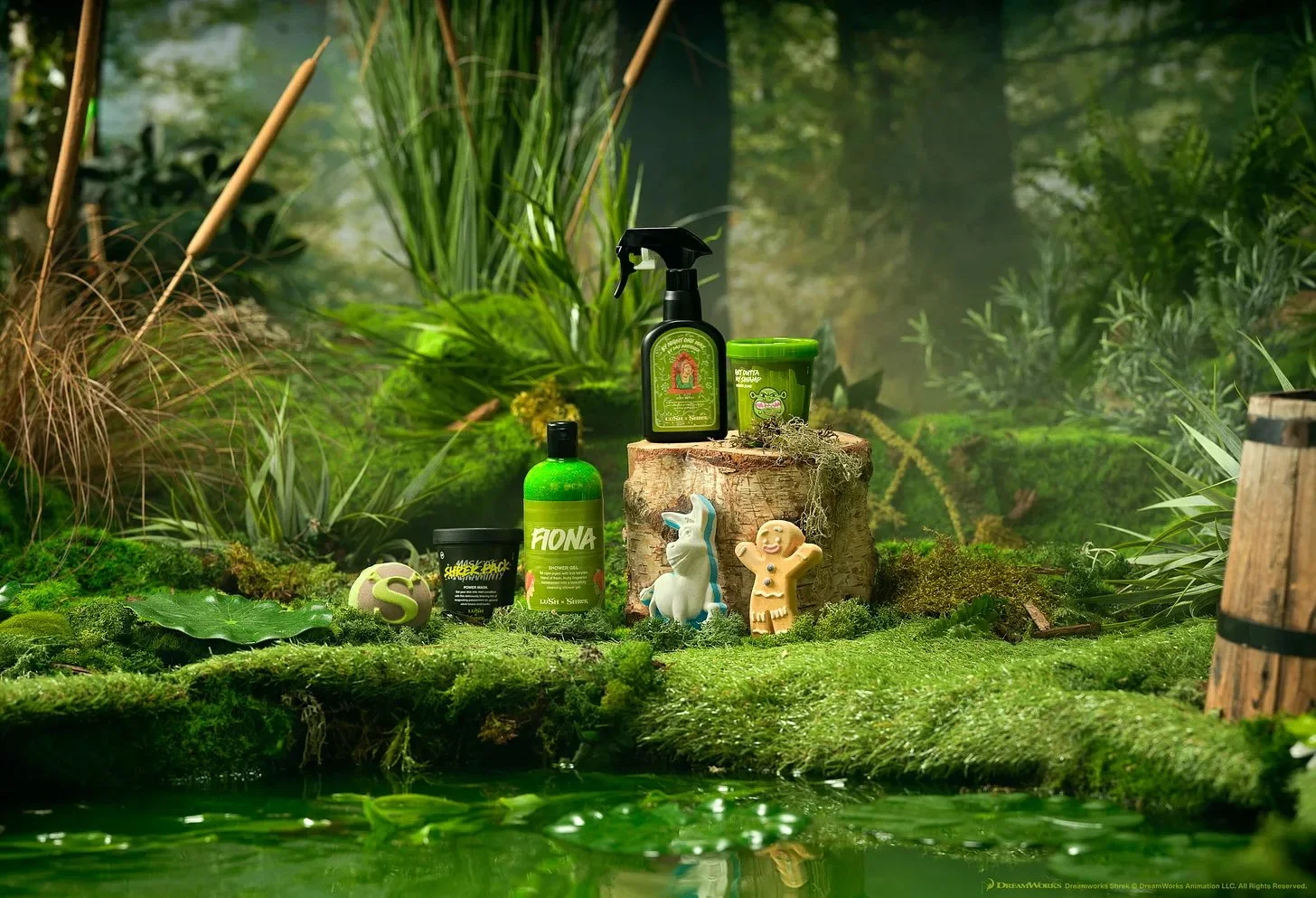
I’m absolutely obsessed with the new, limited-edition Lush x Shrek collaboration. Why does this exist? And why now? Who cares! Self-care is for everyone, ogres included. Self-care can be messy, and what’s best for us often doesn’t feel as effortless as it looks on social media. That doesn’t make it less important, and I think these products, and their packaging, embody that perfectly. Thank you to the one and only Eleanor Hudd for bringing this to my attention.
🤦♀️ Graphic Violence
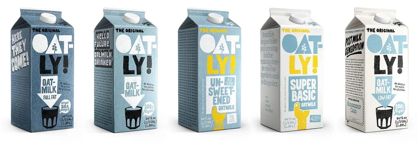
If there’s one thing more fun than finding great graphic design in the wild, it’s finding terrible graphic design in the wild—particularly terrible design by major companies with huge budgets. The winner of this week’s “Explain Yourself” Award is Oatly, which seems to have accidentally given all of its (non-chocolate) refrigerated oat milks the same packaging.
Images from Oatly.com
I have a lot of feelings about this packaging in general. Aside from the fact that I am very done with folksy design on multinational billion-dollar corporations, your name has five letters, and you seriously couldn’t fit it on one line? Be so for real right now, Oat-ly.2
But the biggest problem by far is the utter monotony of this packaging. People seem to forget that the whole purpose of design is communication. In virtually every context but especially grocery shopping, a major part of that communication is speed. It’s smart marketing to make sure your customers can find the product they want quickly and move on. If I had literally invented oat milk, I wouldn’t open the door for competition by making my brand a chore to interact with, but maybe that’s just me.
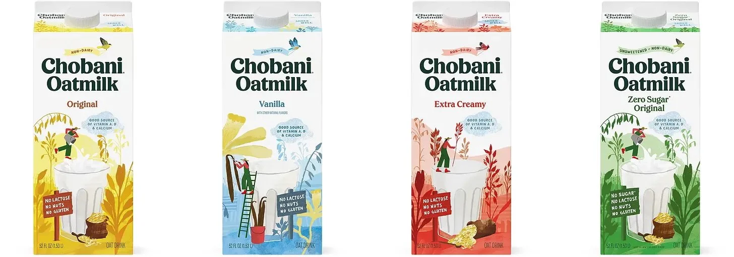
In contrast, Chobani has mastered the balance between coherence and user-friendliness. Taking its cues from most dairy milk brands, Chobani makes it easy for customers to know which oat milk they want and quickly grab it.
Images from Chobani.com
They’ve even colored the “Extra Creamy” red, the (virtually) universal signifier for whole milk among American dairy brands. These cartons pull off everything Oatly is clearly going for—personality, consistent branding, and boldness—in an effortless, accessible package that’s a joy to shop for and drink.
🌱 Touching Grass
📖 What I’m reading: I just finished TJ Klune’s In the Lives of Puppets, and I have to say there is truly one person on this Earth who could get me to read robot Pinocchio and love it. I have a few Claire Keegan novellas on the list for this week (So Late in the Day and The Forester’s Daughter).
🥚 What I’m eating: I have a bunch of chicken, very little time to cook, and a lot of pent-up excitement for my upcoming trip to Japan so it looks like it’s going to be an oyakodon kind of week. Just One Cookbook has my favorite recipe, which adapts super well to meal prepping.
📺 What I’m watching: I mean now I kind of feel like I need to watch Shrek.
🛍 Where I’m shopping: I visited Hartford Prints! for the first time this weekend and it’s my new favorite gift and design shop in the state. I can’t wait to go back soon.
🤸♀️ What’s changing my life: I was lucky enough to spontaneously attend the US Classic—the kickoff to the Olympic gymnastics qualification season—in Hartford this past Saturday night. There’s nothing I love more than watching people who are the best at what they do, and watching Simone, Shilese, Suni, and more work their magic live is an experience I’ll never forget.


